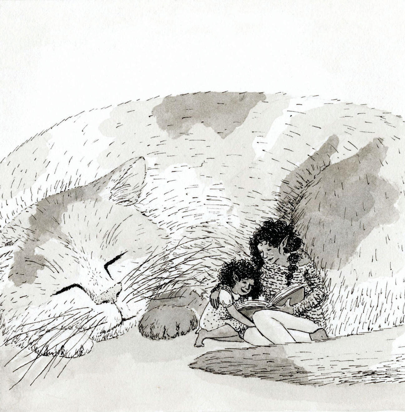

My illustration work spans a variety of applications, but I always try to bring a sense of peace and wonder.Click on any image for a closer look!
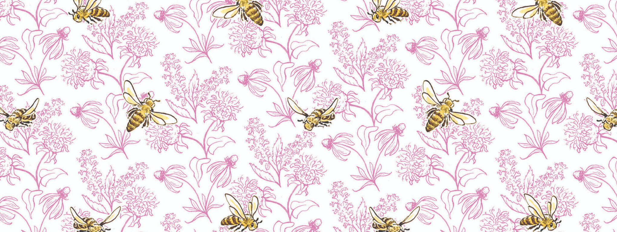
Pollinator Garden Patterns
These three traditionally drawn patterns were created for a hypothetical line of pollinator garden-themed gardening supplies.The designs feature honey bees, along with three wildflowers (Bee Balm, Anise Hyssop, and Prairie Coneflower) that grow well together and are particularly known for being bee-magnets.
Ebenezer Child Care Mural Design
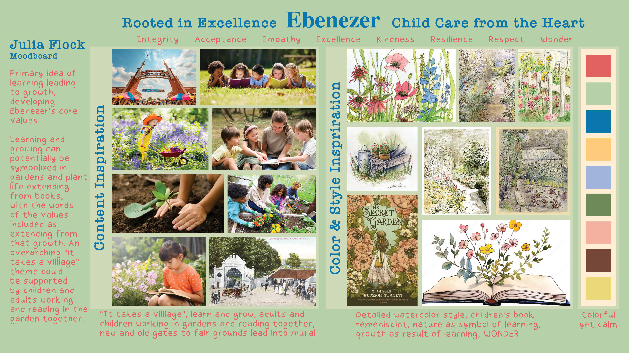
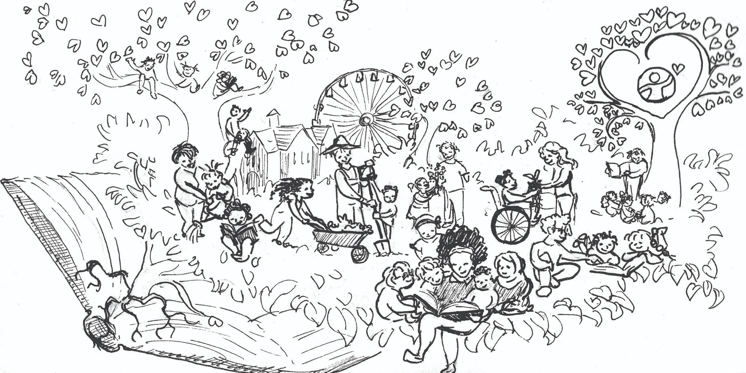
I was part of a team of MIAD students commissioned to create concepts for a mural that will eventually be installed in Ebenezer Child Care Center's West Allis location.We each took into consideration themes of community, diversity, and learning, emphasizing connection with West Allis and the outdoors.The client asked for a more painterly style, leaning towards realism with bright colors. This gave me an opportunity to bring my fine arts style into an illustrative application. This is my first illustration done fully in guache.
Process: Moodboard
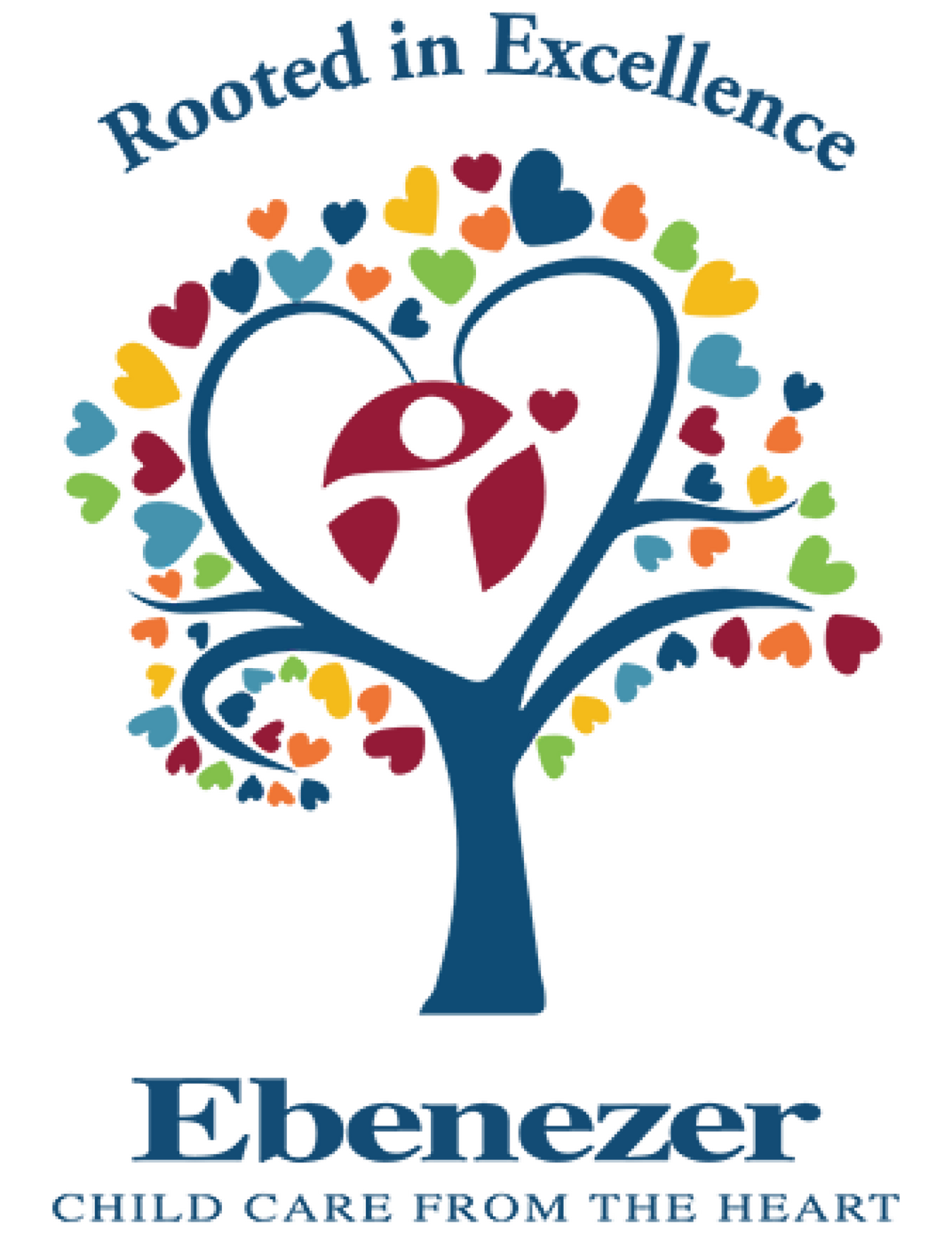
Revised color based on Ebenezer Child Care's logo.
Process: Initial Concepts

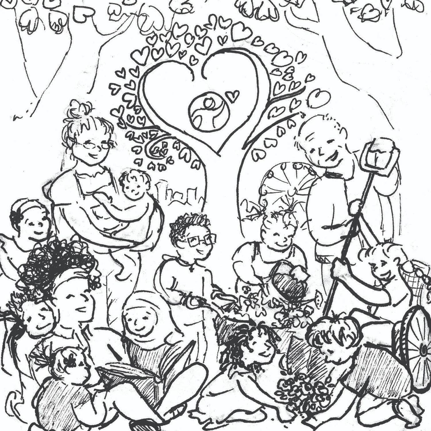
Process: Revisions


Process: Tight Sketch

Cicero Posters
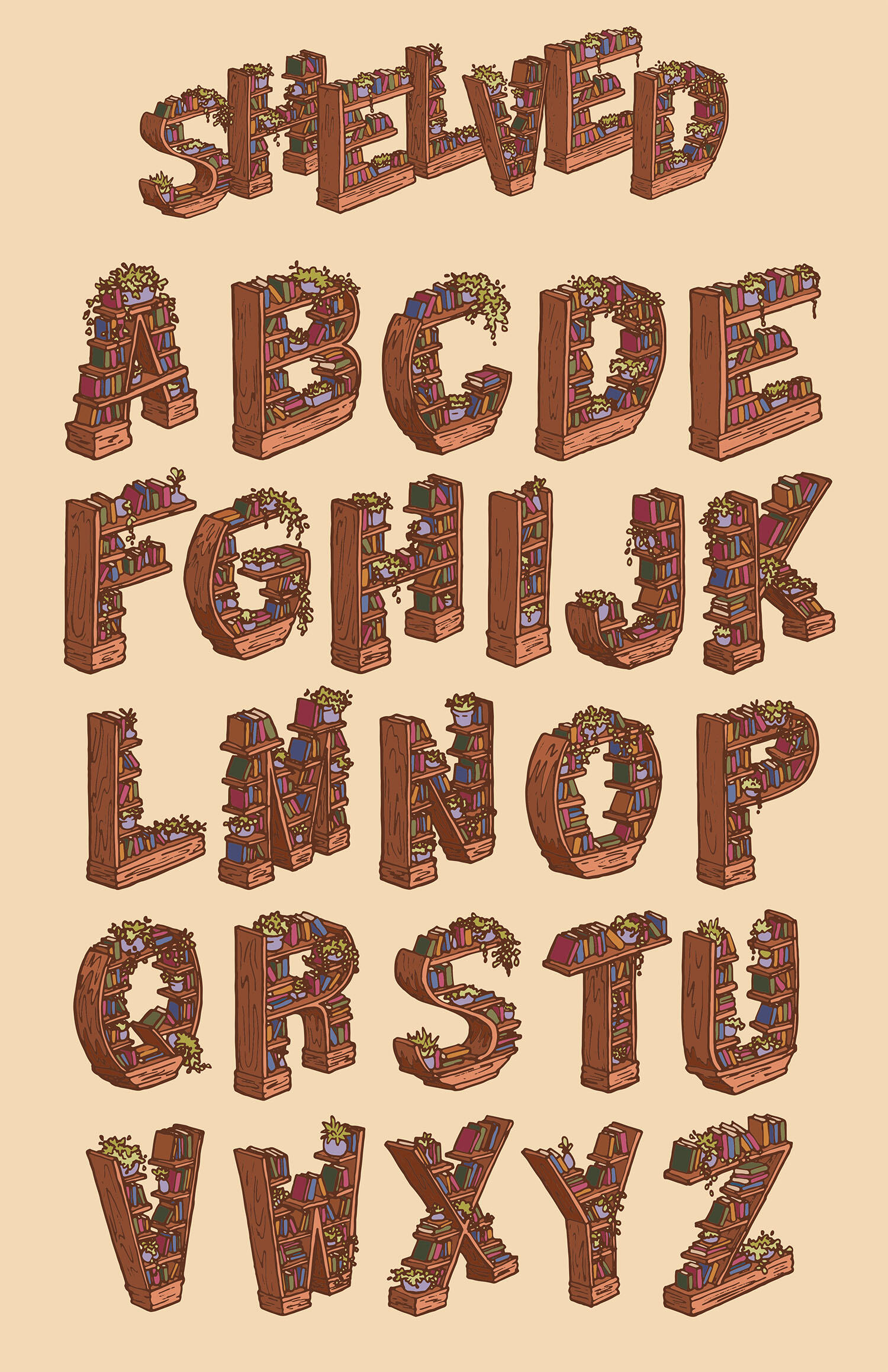
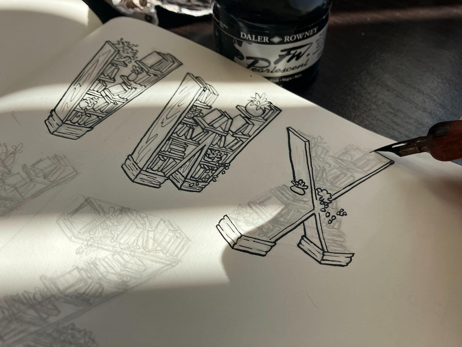
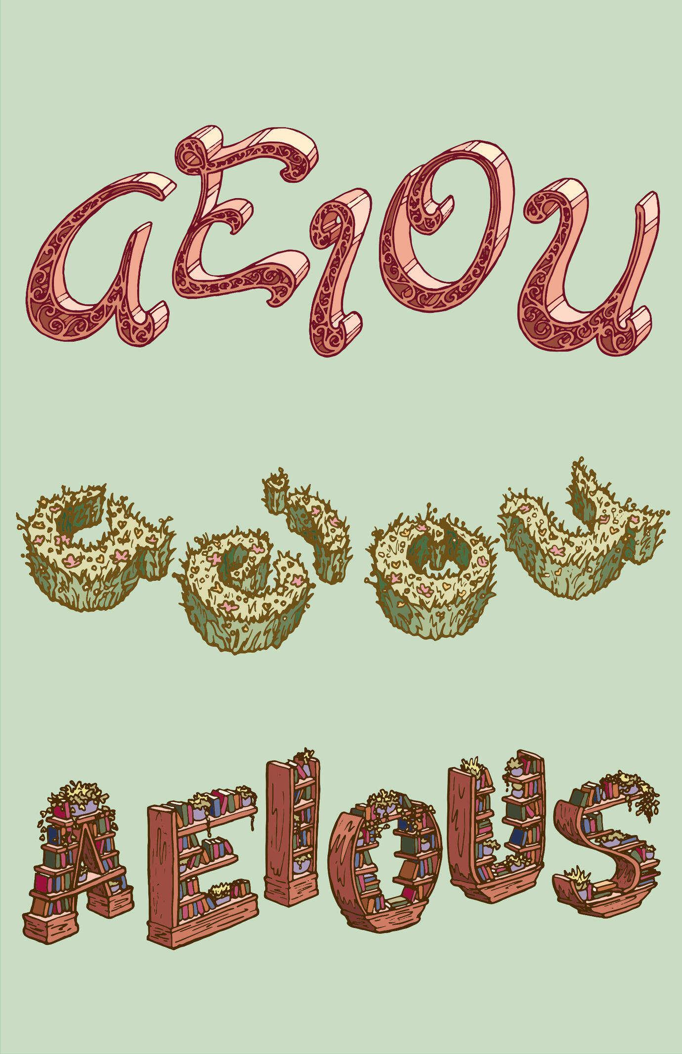
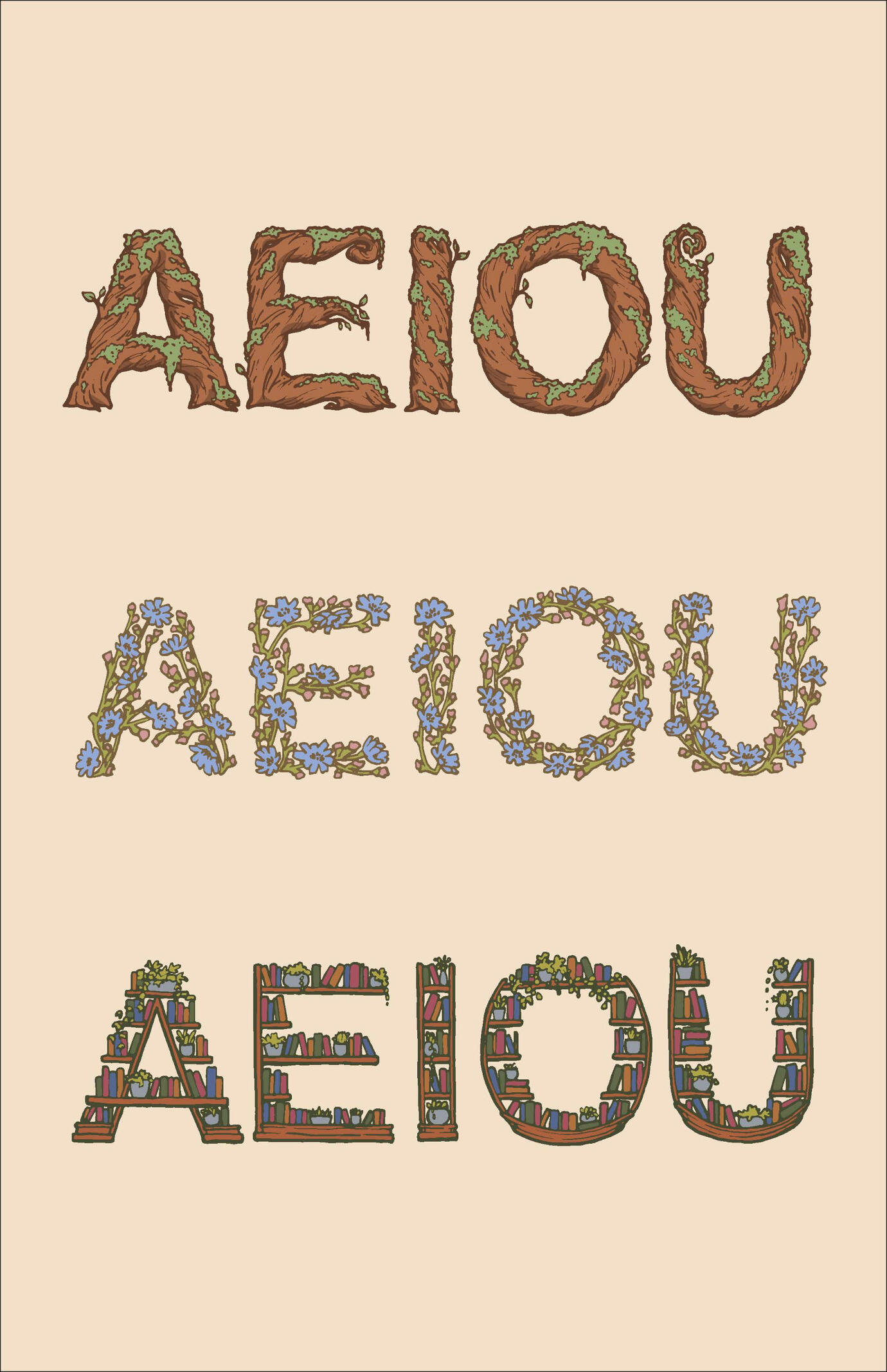
These posters took the elements I created in my Shelved Alphabet and put them together and populated them in a way that brought them to life as a true little library. Look closely and you will find children absorbed in stories and cats slinking around the shelves.This project quickly developed from a simple exercise in three-dimensional letterforms into the creation of a little world filled with books and plants.Beginning with an old-fashioned dip pen and ink well and ending with vectorized letter forms that can be used in a multitude of contexts, I became absorbed in the process and the little details that brought these shelves to life.
Margaret Delands Poems
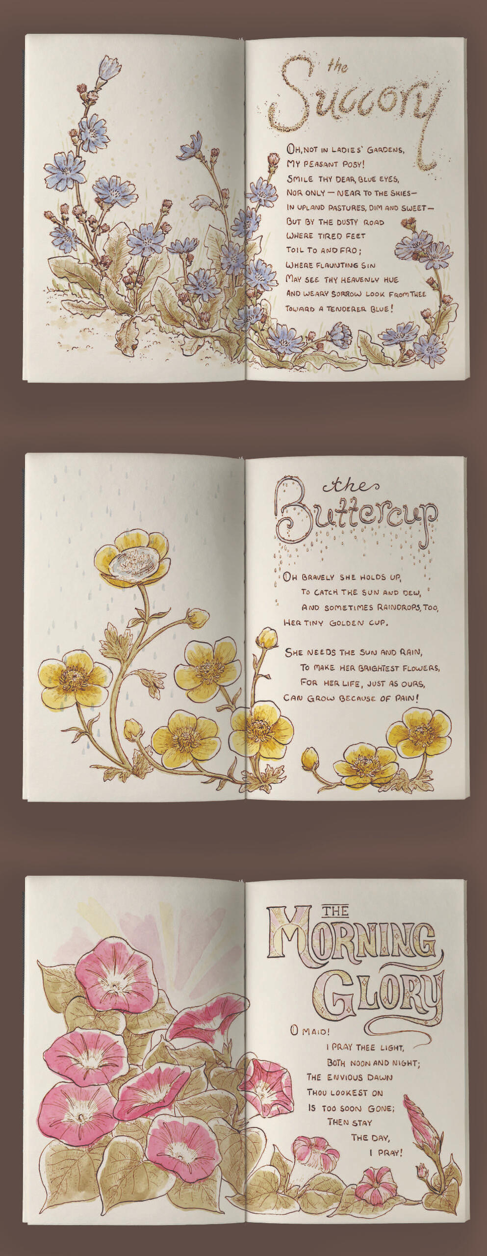
Margaret Deland's The Old Garden and Other Verses is a beautifully illustrated book from the 1800's. Here you find my own illustrated interpretation of her original poems.
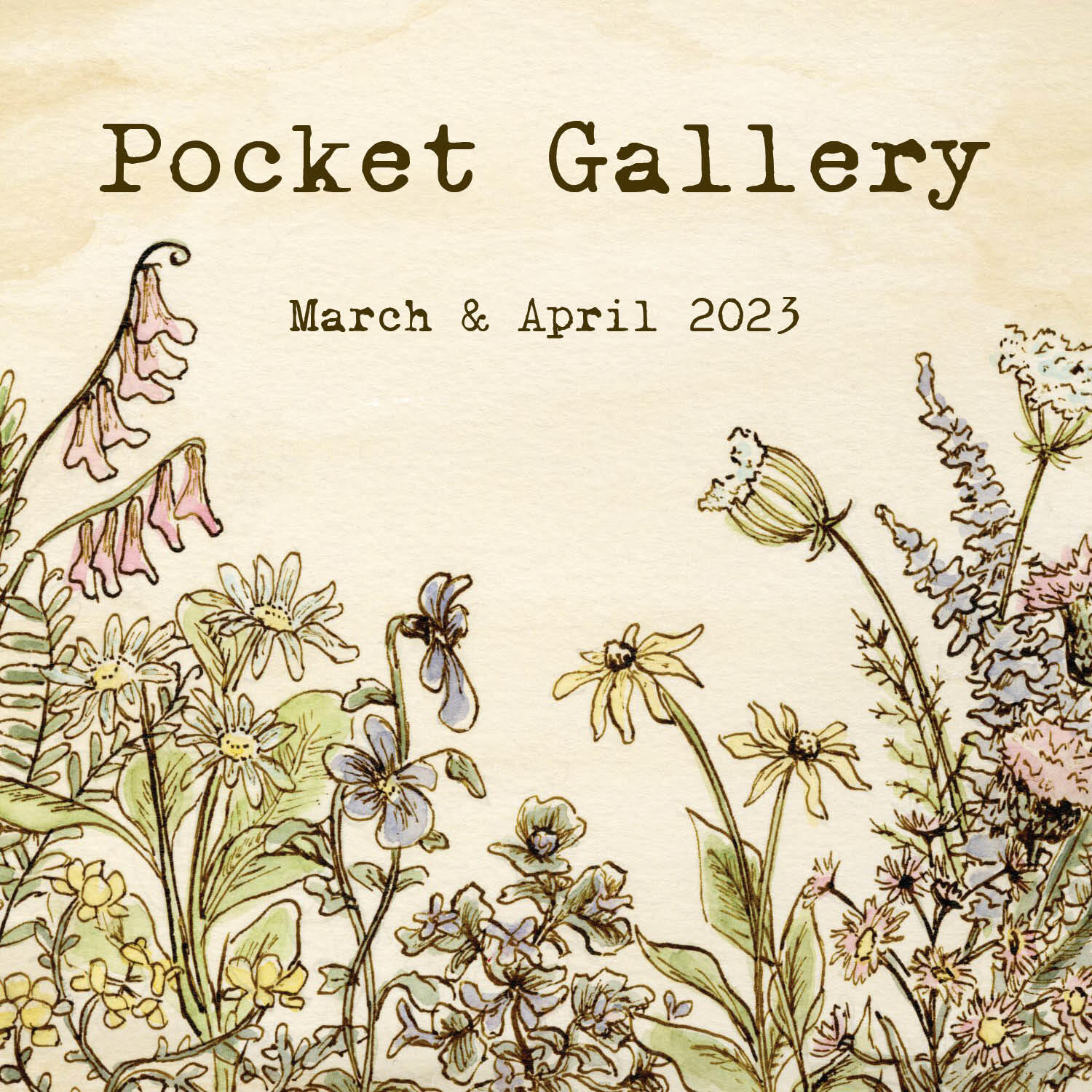
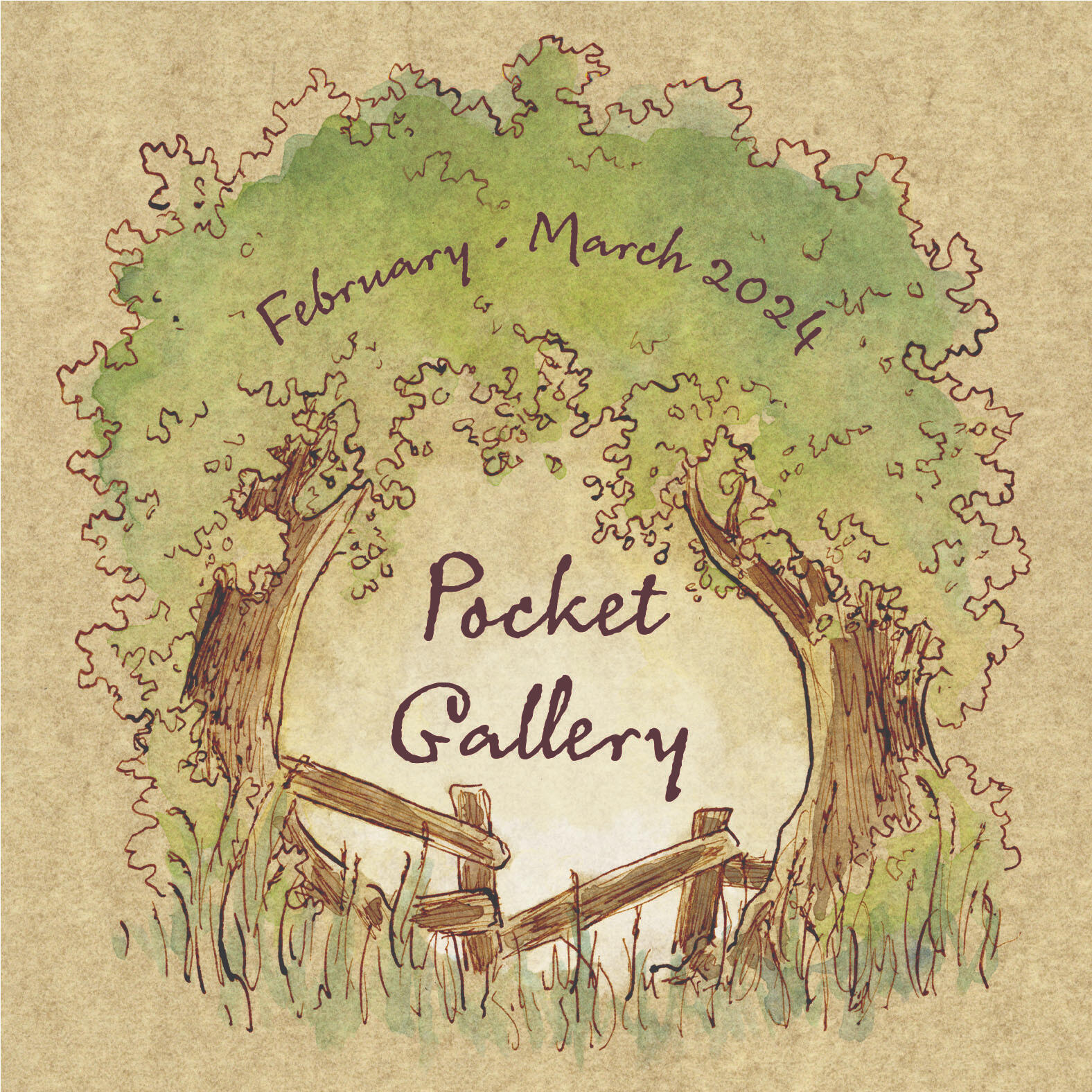
Pocket Gallery Covers
I am part of MIAD's Pocket Gallery Club, which creates a bi-monthly publication of student work. I have done all sorts of work in this group, from designing posters to creating business cards to illustrating covers and patterns. It is a wonderful way for students to show off their own work and connect to the work of others.
Lura Book Illustrations
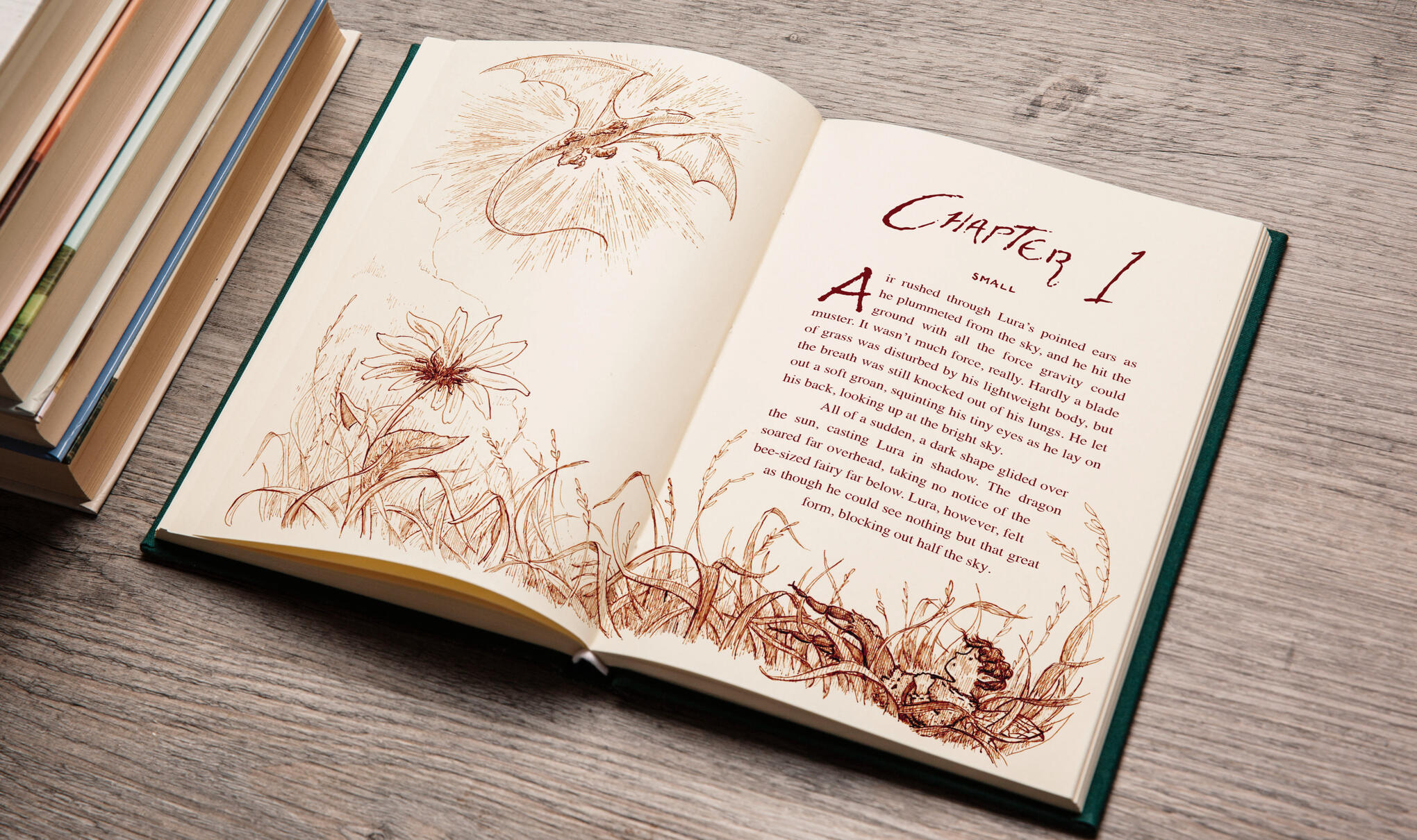
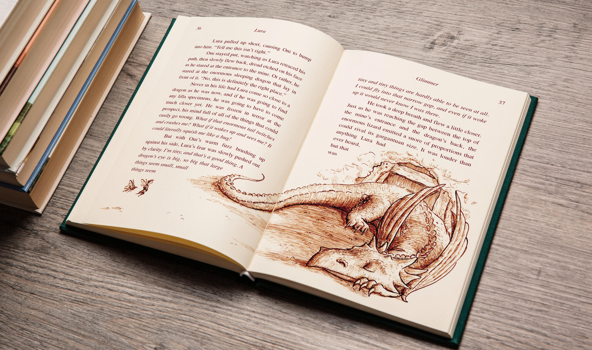
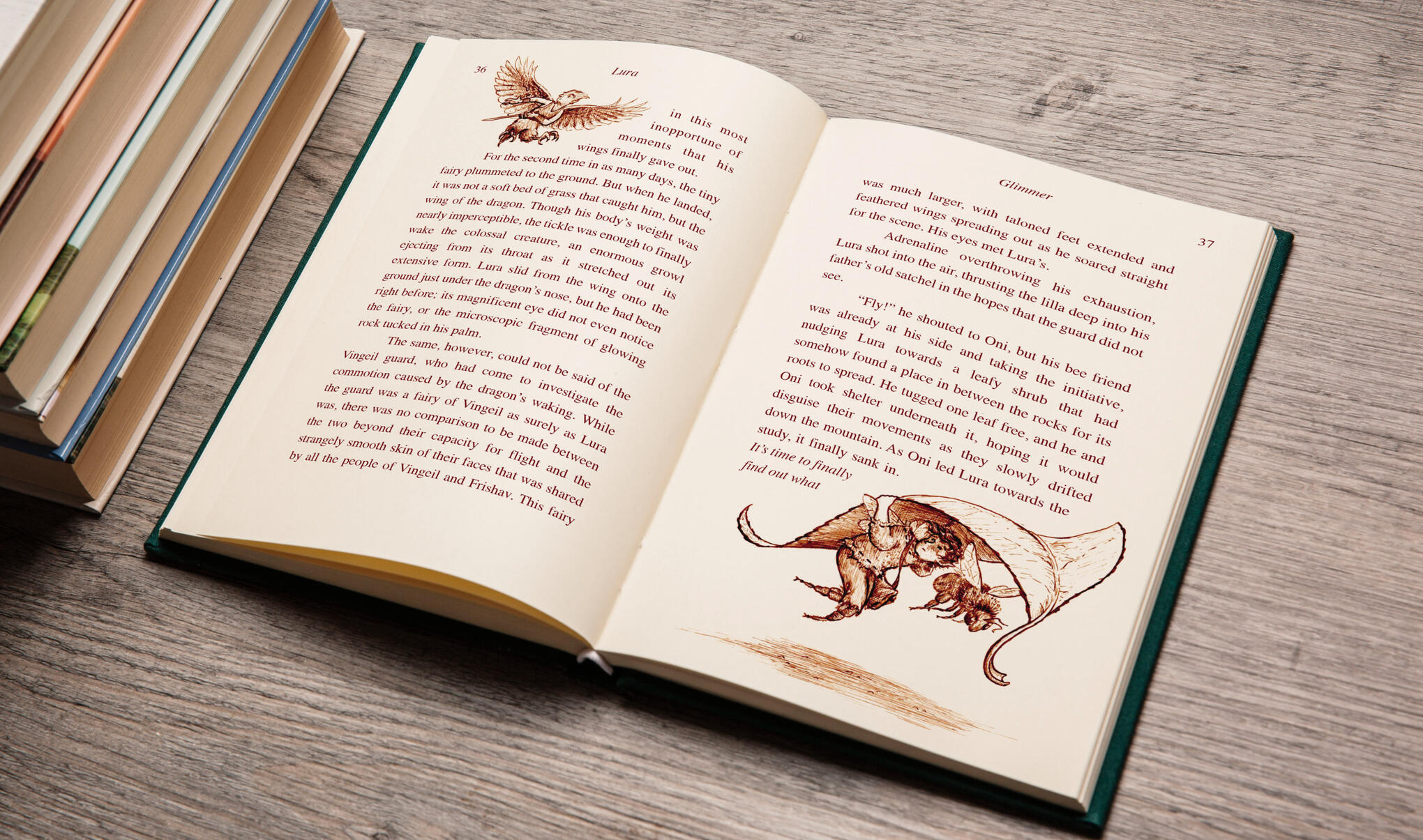
Lura's story is an ongoing project I have been working on for some time. The tale follows a little bee fairy named Lura, his little sister, Selvie, and their honey bee friend, Oni, as they go on a quest to Olgebran, the mountain where dragons dwell, to find reason so many of the creatures are reverting into their non-magical forms and save their mother from this same fate.I used this opportunity to develop monotone illustrations for my portfolio. Most of my work is in color, but exploring the possibilities of linework on its own has allowed me to push value and texture in a different way. Working in a composition that involves so much text also put me into a different territory as I played with the balance between text and illustration. I can't wait to play with this story more in the future!
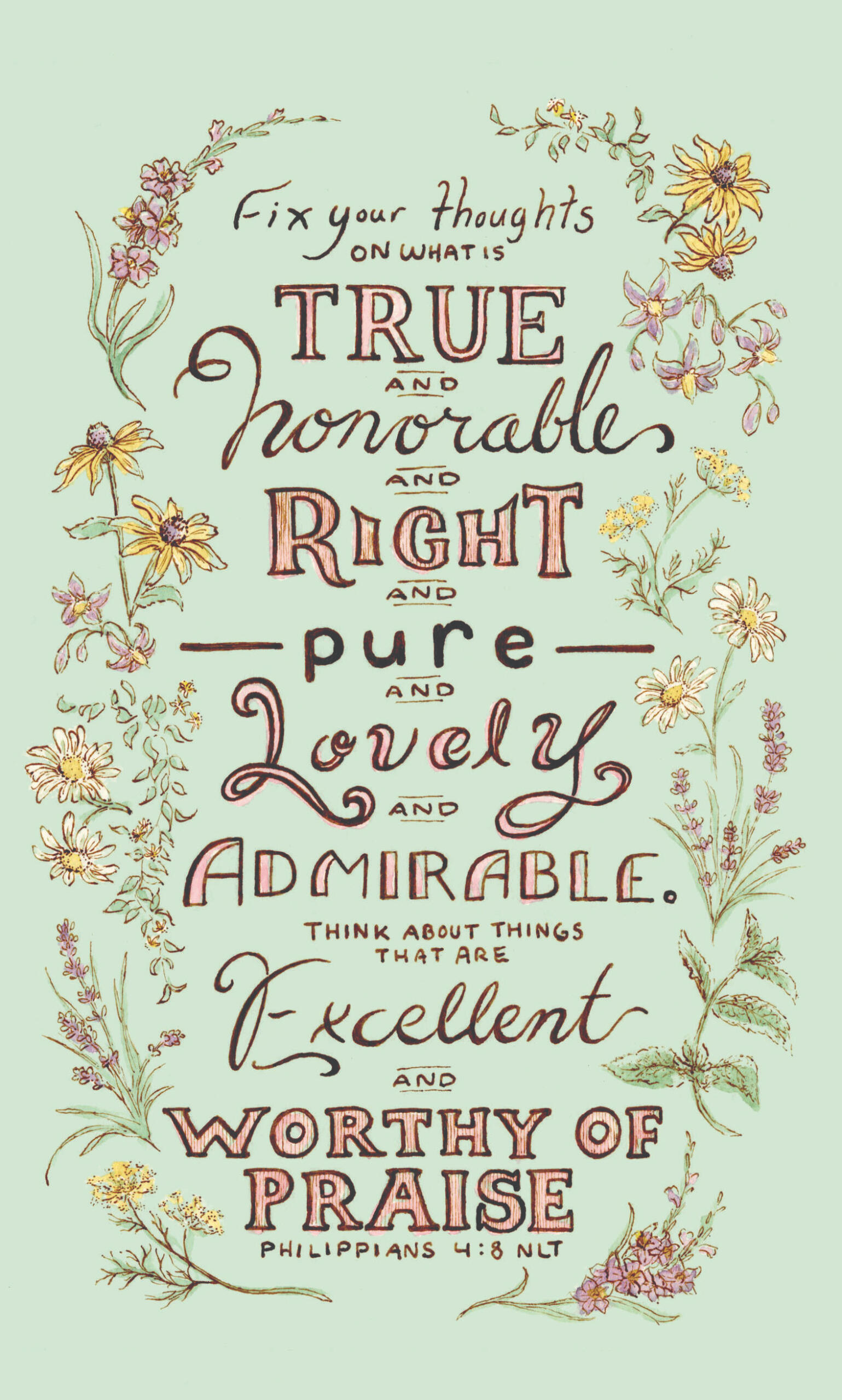
Philipians 4:8 Journal
This project is still in its beginning stages. I would like to explore low-content books, so I am beginning a series of journals that will be filled with little illustrations.I have put so much research into this project that connects my love for scripture and for flowers, and cannot wait to share more once it is complete and published!
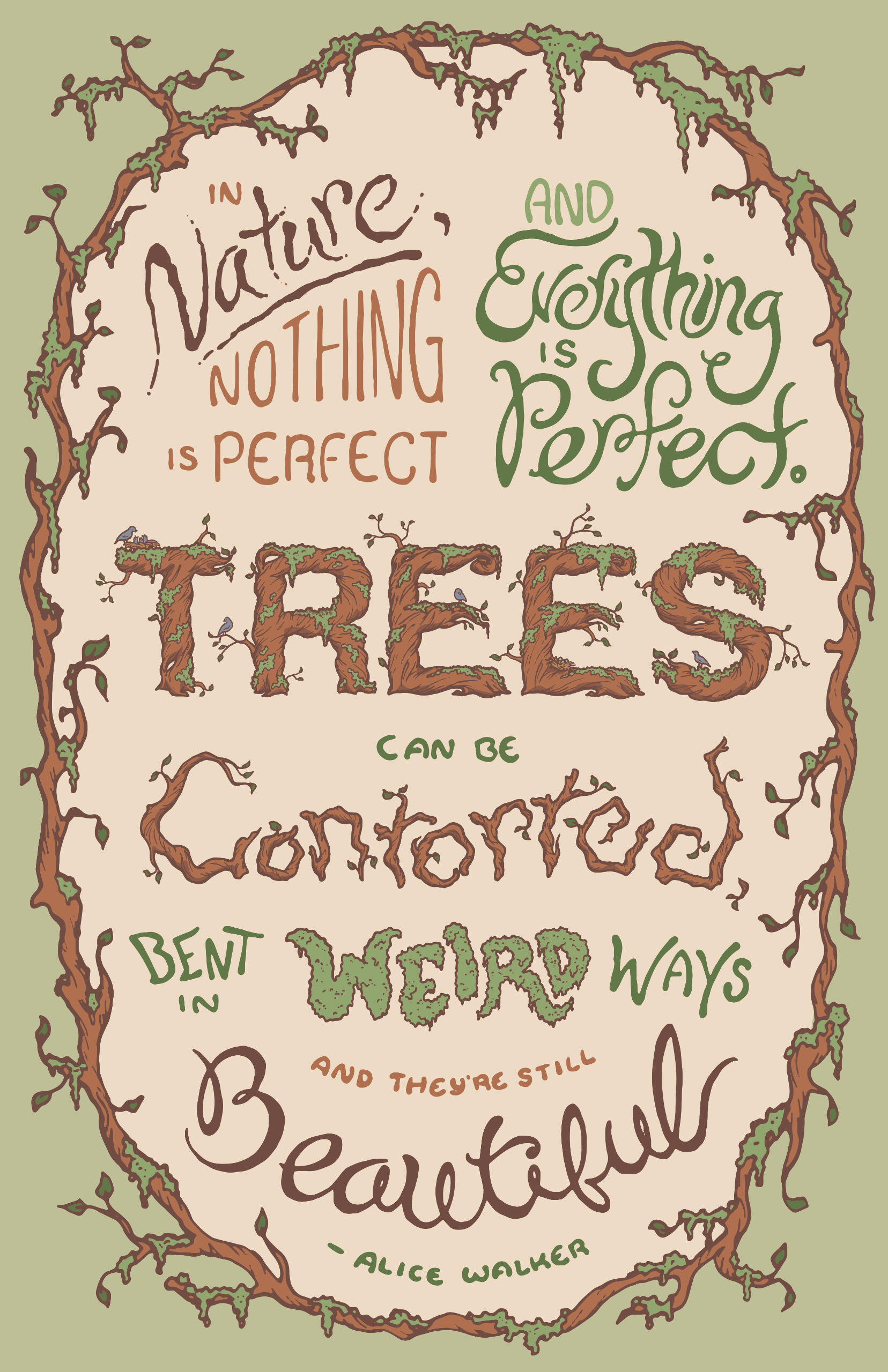
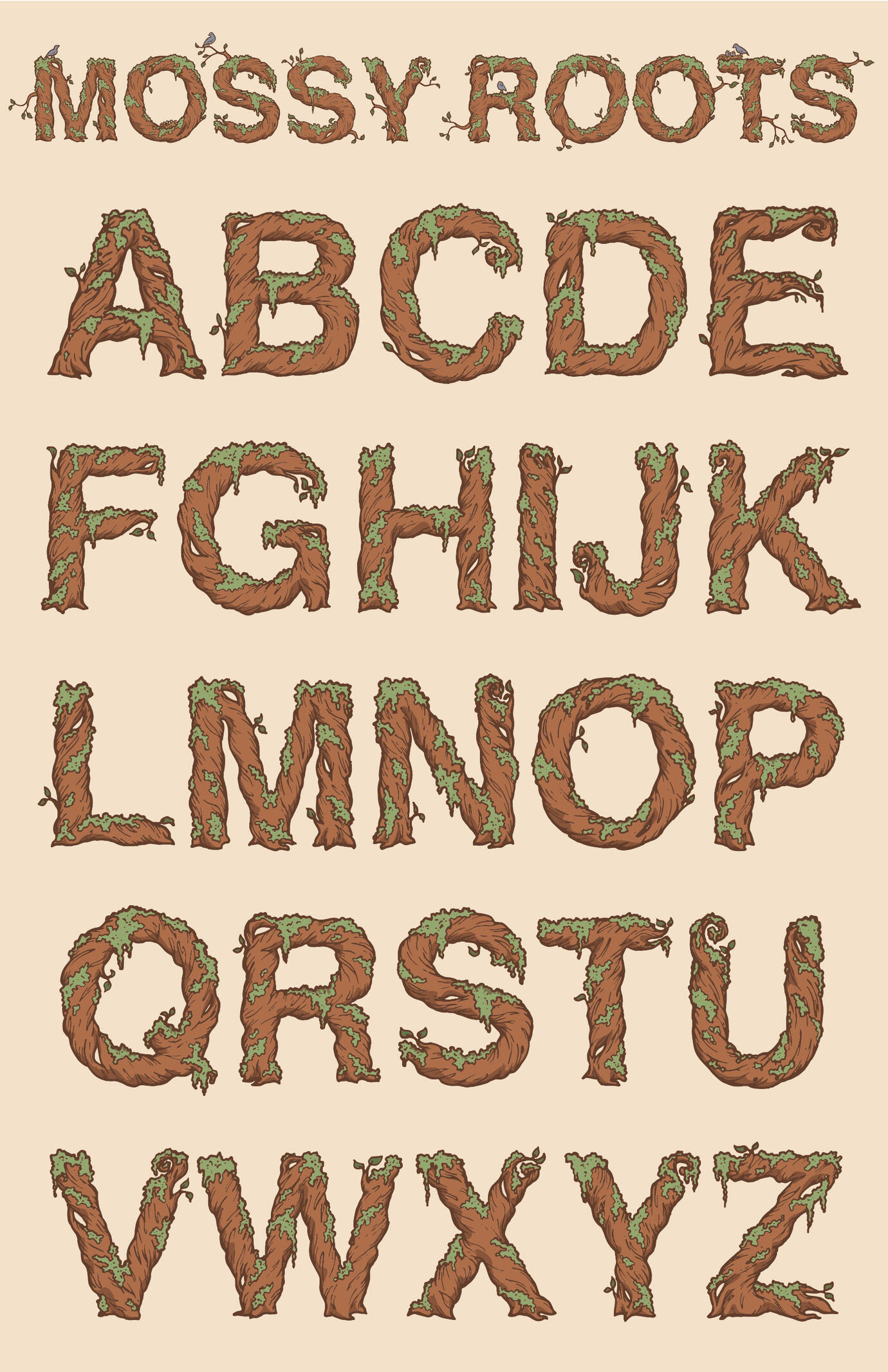
Mossy Roots
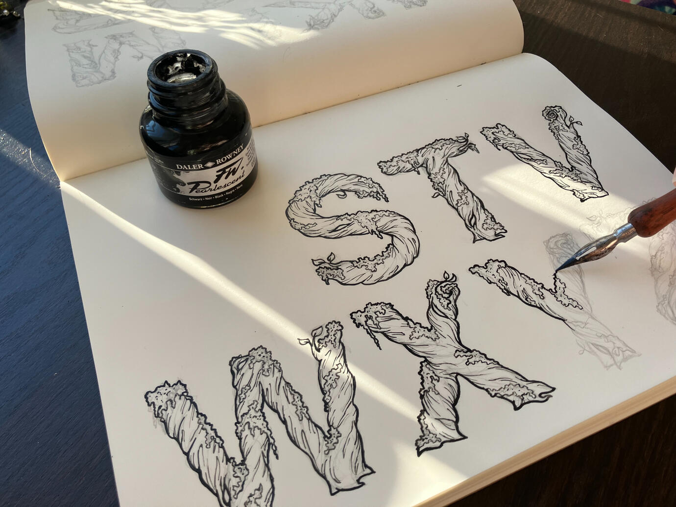
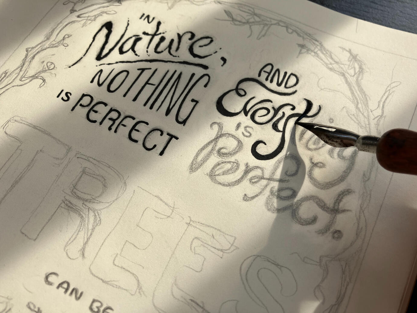
I have finally begun to explore the possibilities my illustration work has in the world of vectors! In the past, I have viewed vectors as something to use only in cases of extreme simplification, but through this project, I have begun to discover ways I can continue my detailed work within the many applications of vectors.This project began with the creation of a full alphabet that takes a creative spin on the basic form of Helvetica Bold. I played around with lots of ideas, but loved the way my Mossy Roots twisted around the rigid forms in a very fluid way, and provided plenty of opportunities to push beyond the original font. Then I got to play around with extra elements that could interact directly with the letterforms, and create a composition in which it could be used.As with all of my work, I began with a pencil to paper. I created all the forms using a dip pen and ink, then vectorized and arranged them in Adobe Illustrator.
Annadee the Wingless
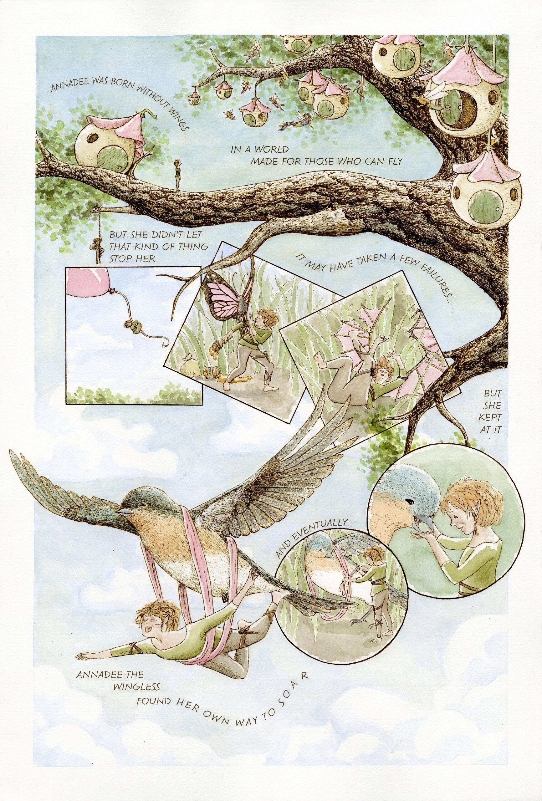
This single-page comic is a concept for a future children's book series idea about a wingless fairy who goes on adventures to find her own way to fly. The story is about not letting a world made for one kind of person stop you from reaching your full potential, and about thinking outside of the box.When it comes to sequential art, thinking outside of the box is important for me. I love to break out of the box (literally) and explore how the shapes of panels, form of text, and background can all interact with each other, leading your eye in ways unexpected, yet natural.This piece was rendered with lines drawn with dip pen & ink, simple watercolor washes layered overtop, and text added in Illustrator.
Trek Earth Day Ride
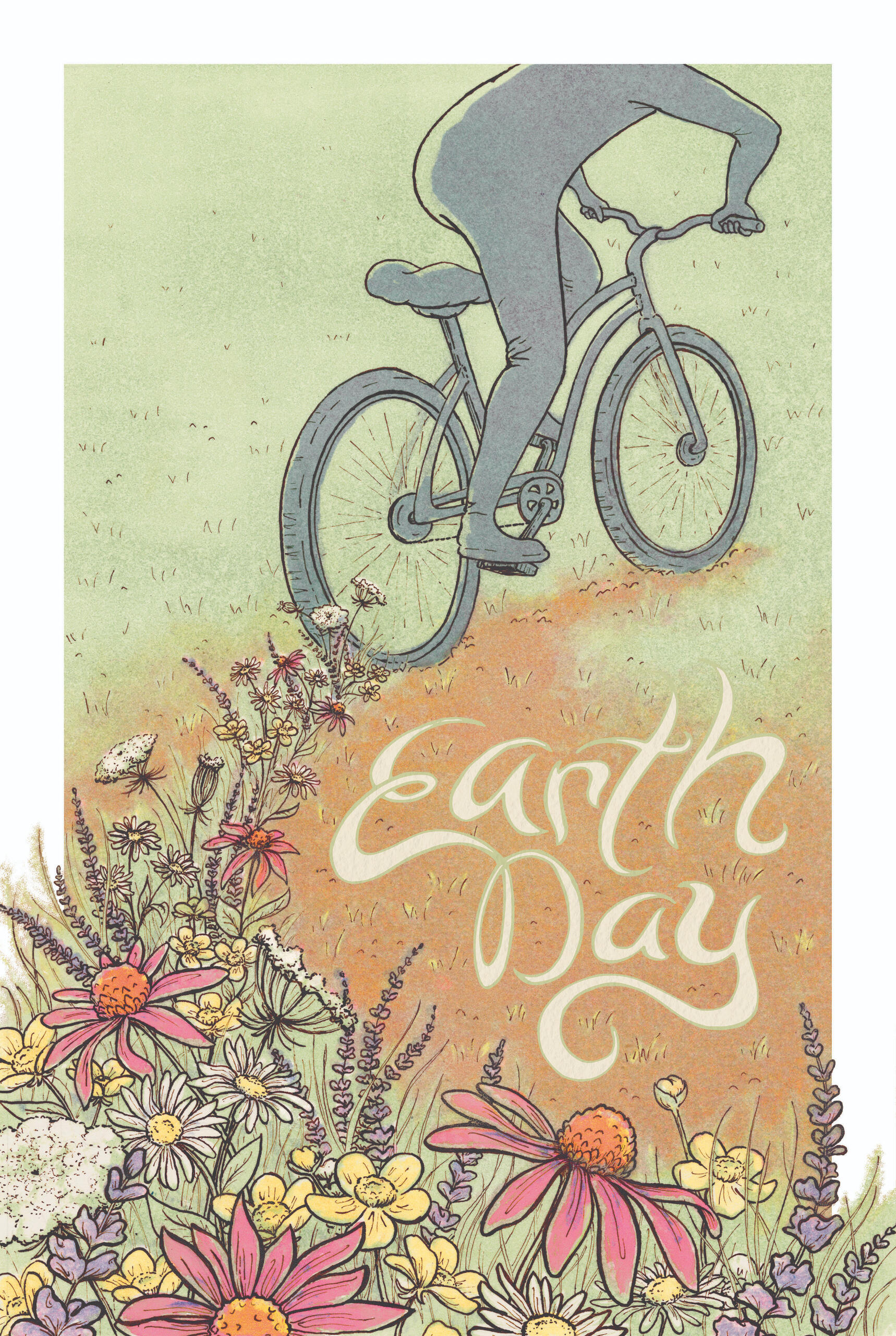
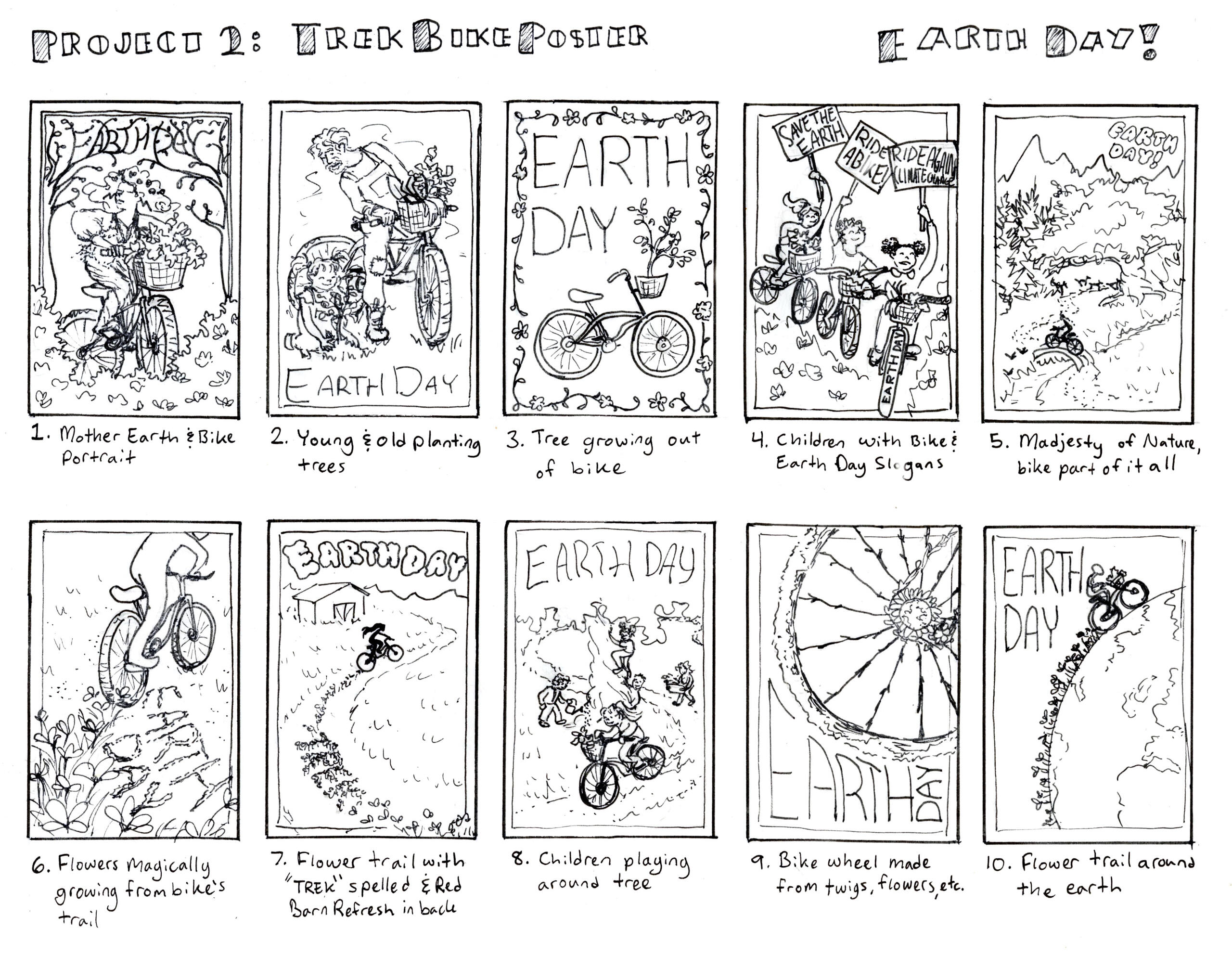
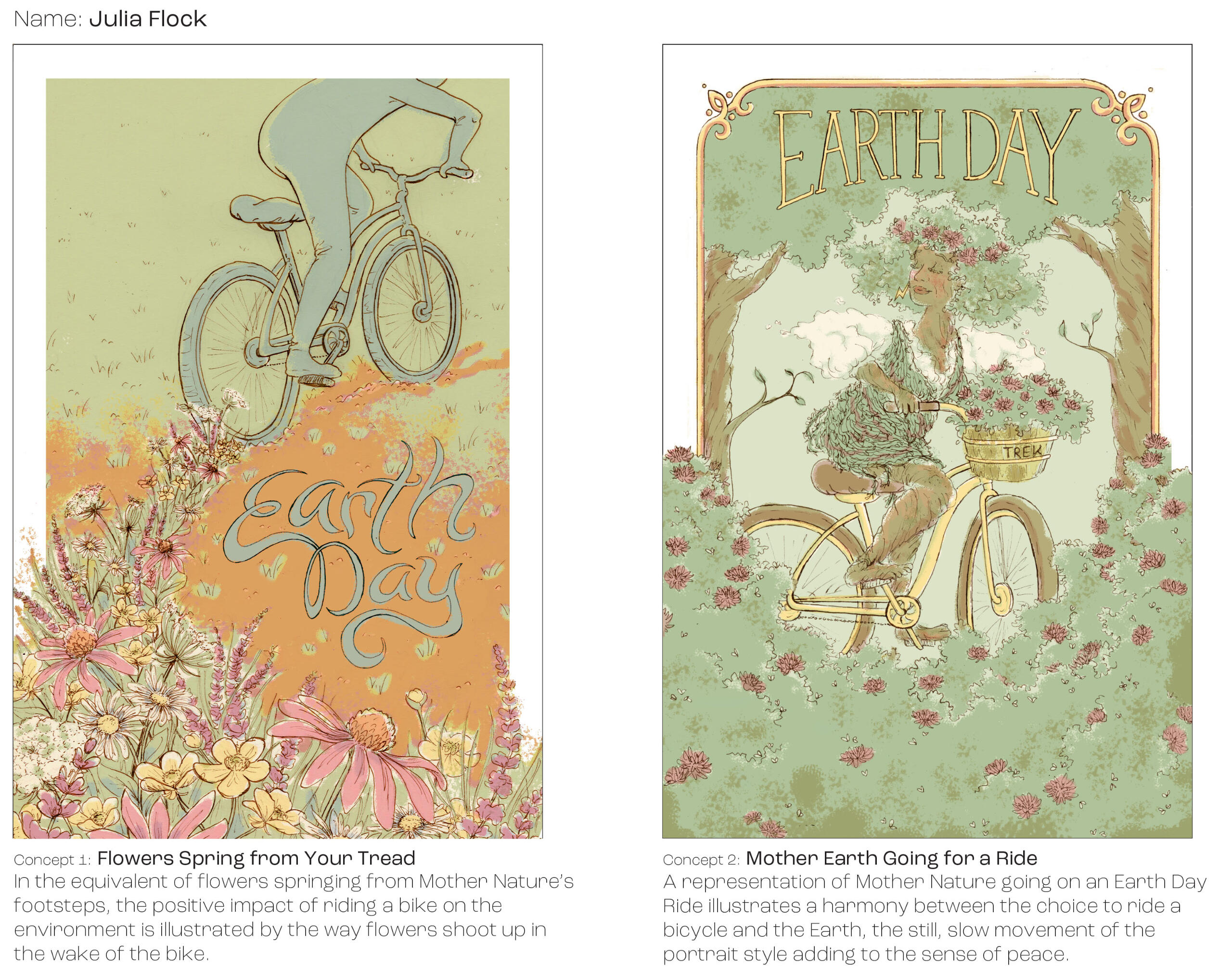
This poster was one of 20 finalists in a student competition among the Milwaukee Institute of Art and Design's junior Illustration class, creating posters for Trek Bicycle's bike ride events.The Earth Day Ride celebrates the positive impact of bikes on the environment as a greener transportation option. To this end, flowers springing up in the wake of the bike's tread emphasize that healthy relationship.The linework was rendered with dip pen & ink, with transparent monotypes layered on top to give a color quality that cannot be entirely replicated digitally, adding something of a vintage feel.
Process: Concepts and Tight Sketches
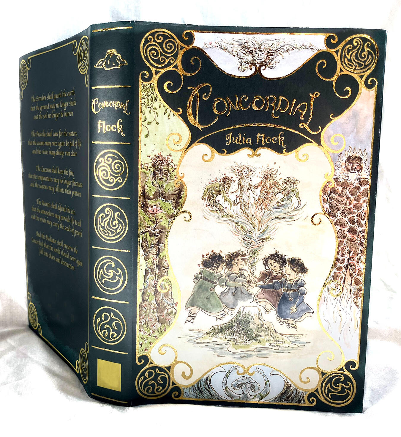
Concordial
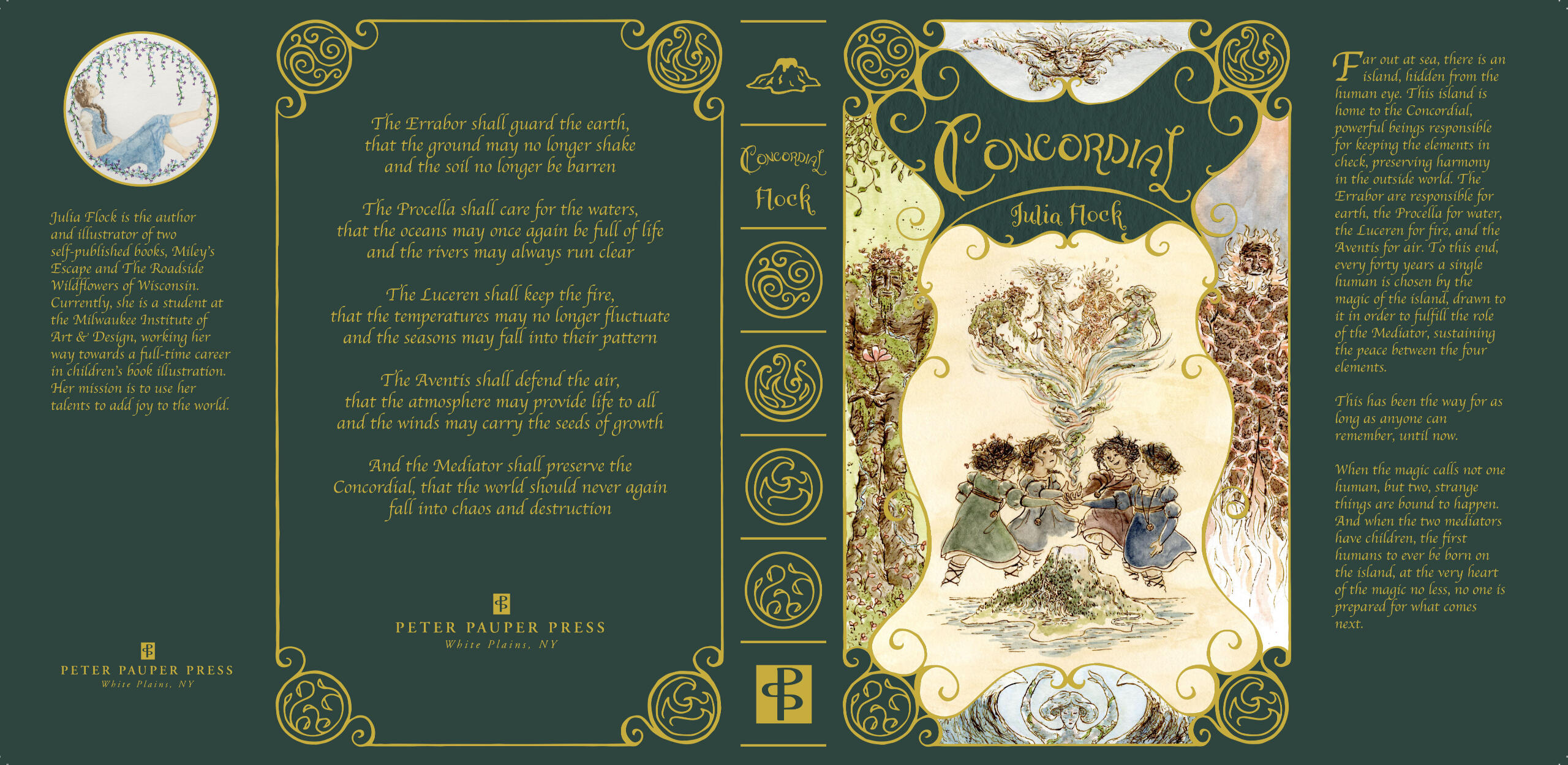
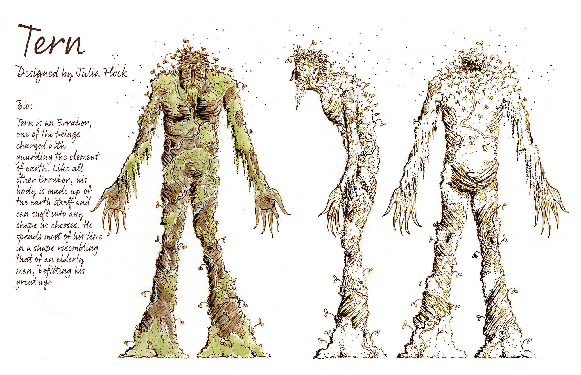
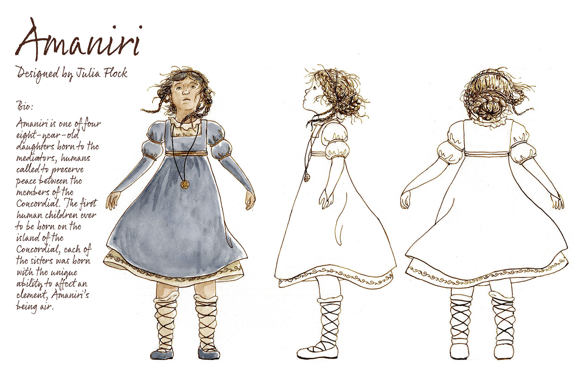
Concordial is an ongoing world-building project, revolving around the story of four little girls with the ability to influence the elements.The dust jacket is for a hypothetical novel. In addition to my typical pen & ink linework and watercolor washes for the illustrations, the design of the book involved a lot of work in both Adobe Illustrator and Adobe InDesign. I also experimented with gold foil for the physical mock-up of this project.*note that Peter Pauper Press is not involved in any way, the addition of a hypothetical publisher was required as part of the assignment.
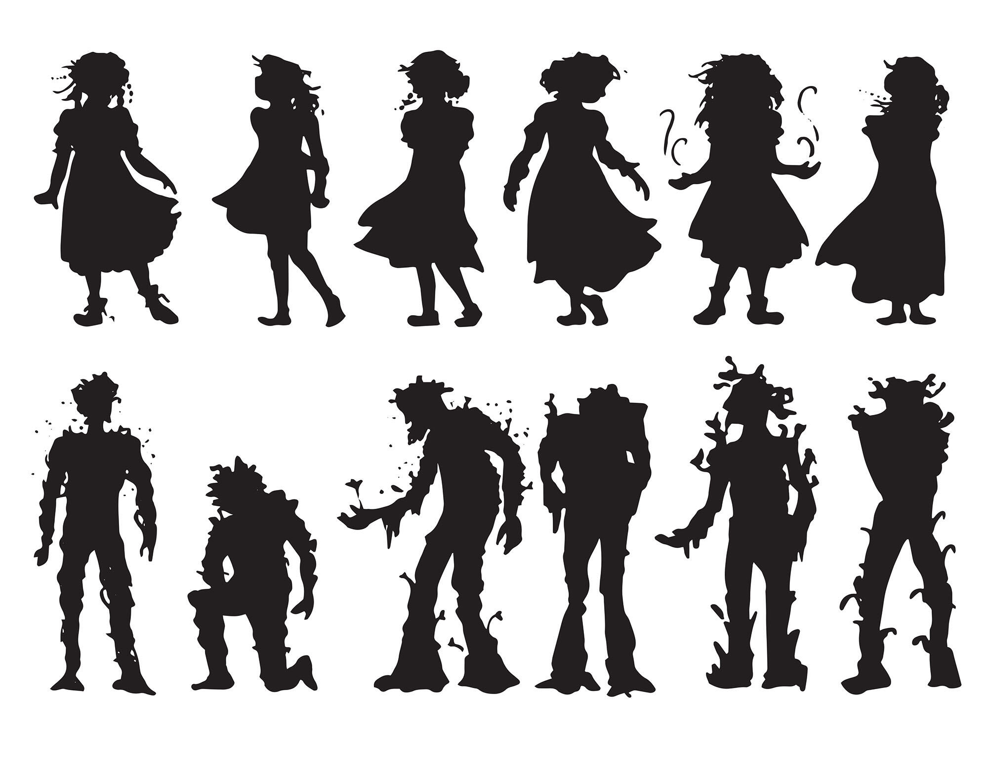
Character designs were begun by working in simple silhouettes, moving onto more and more detailed planning as I continued along.
Tea Can Packaging
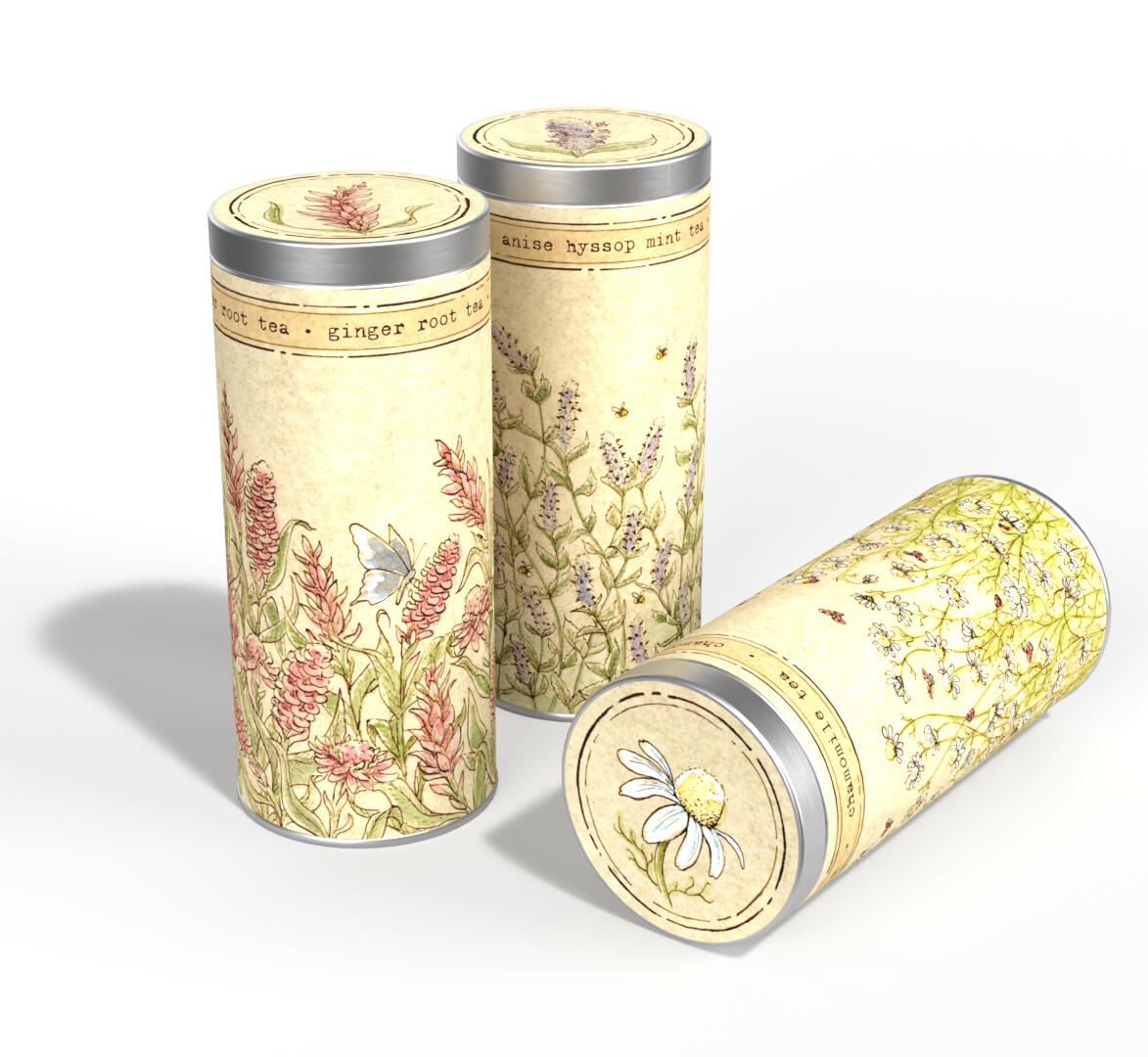
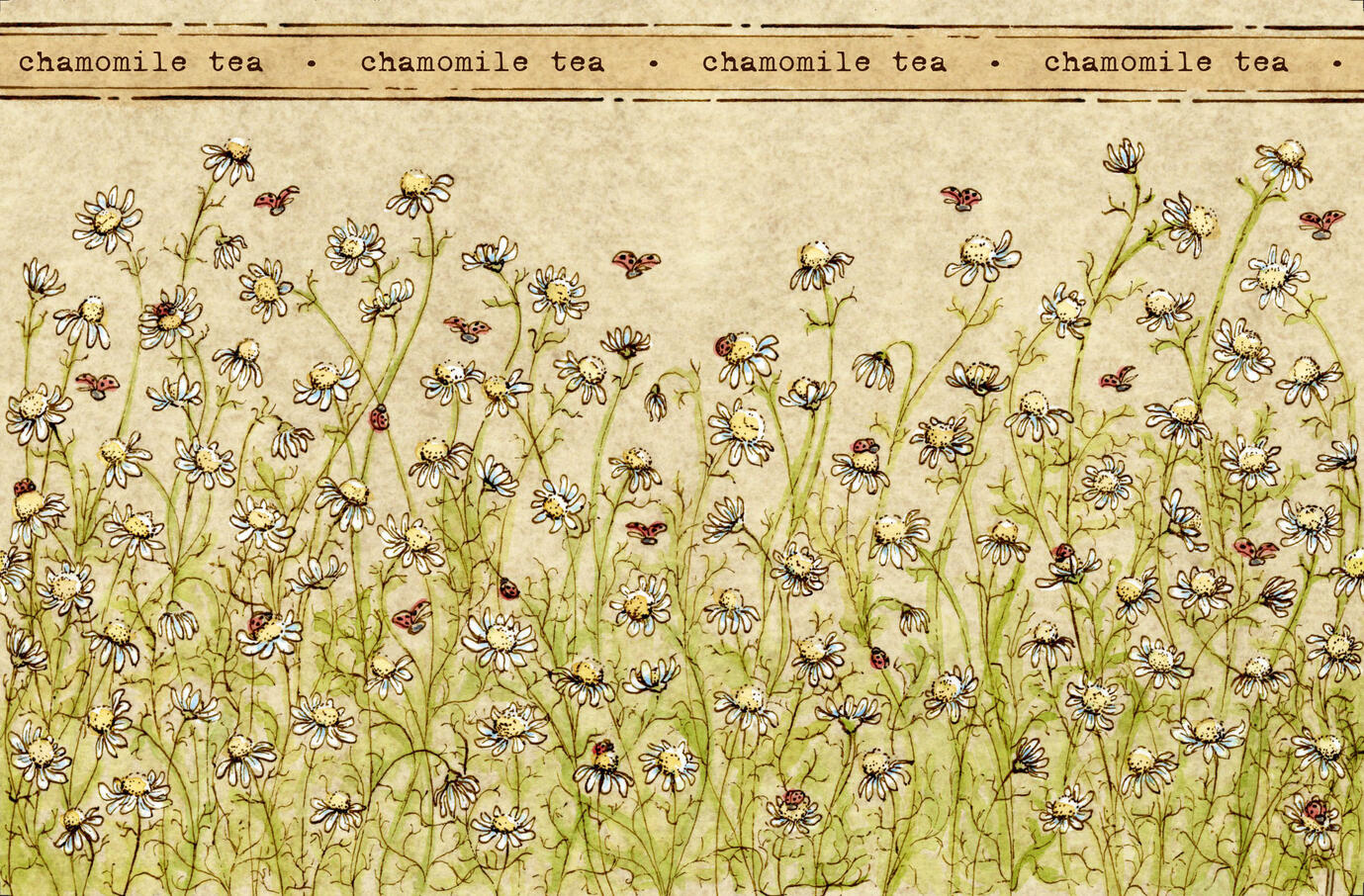
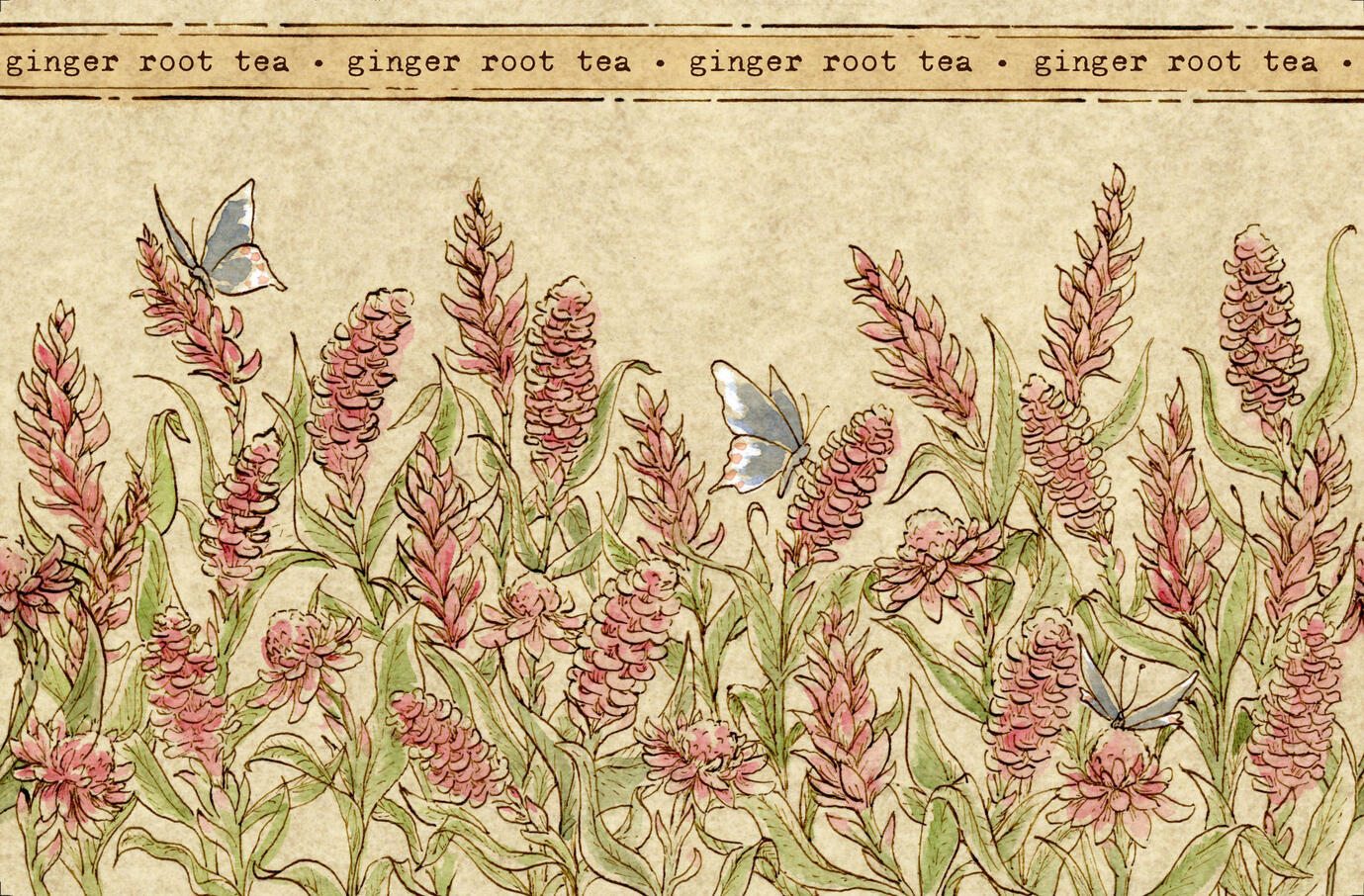
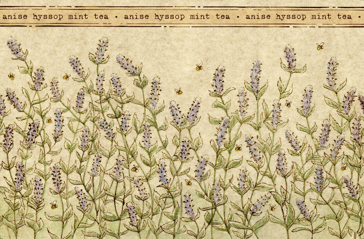
This project was created as a class project, making collectible canisters of a chosen product. My goal was to create tea packaging that would appeal to the nature-loving, organic foods audience with muted illustrations that focus on the flowering plant from which the teas are made. The addition of pollinators and the insects that love these plants increases the movement and life of the illustrations. The illustrations are 360 degrees, connecting seamlessly in the back.The illustrations were created with pen & ink and watercolor washes, with paper texture added digitally and text incorporated in Adobe Illustrator.
Monarch Wings Cereal
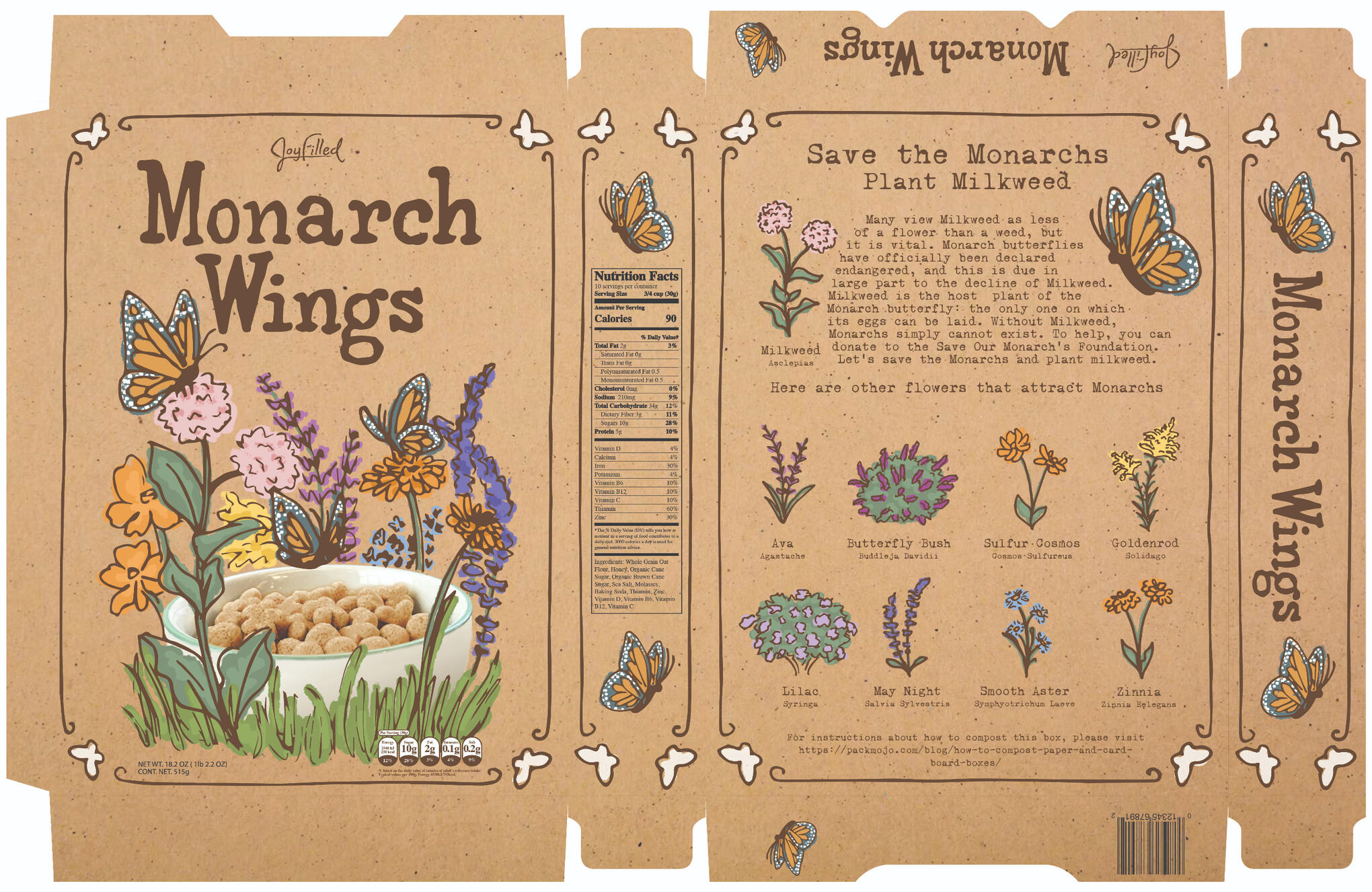
My target audience for Monarch Wings (a hypothetical cereal) is adults who prefer organic and natural foods.This school project was a combination of traditional and digital rendering, also involving some prop-design and photography. My lines were drawn traditionally, then vectorized in Illustrator. The colors were done with flat, digital colors, in order to evoke the feel of screen printing, and layered on top of a craft paper to appeal to my organic-foods audience.
Charlotte Brontë's 108th Birthday
This animated Google Doodle was created in honor of Charlotte Brontë's 108th Birthday, as part of a class assignment. Going into this, I knew that I wanted to do more than praise her most famous novel, Jane Eyre. I wanted to call attention to what Charlotte Brontë's work did, telling stories about a woman who would not be kept in a cage, thus breaking out of her own cage and illuminating the way for other women to follow in her footsteps.All the components of this animation were created using traditional media and afterwards put together in Photoshop. The detailed dip pen & ink line work, overlaid with muted watercolor washes, recalls the 19th century etchings common in books during Charlotte Brontë's time. There is something so fun and exciting about seeing that art style come to life with motion!
Twirl & Twirl & Twirl
My first real attempt at animation using traditional media was created as part of an advanced figure drawing class. While the process of hand drawing and painting so many frames with my watercolor over dip pen & ink was painstaking and took a shocking number of hours, the result was gratifying, and opened up a whole new way of making! For the most part, I will stick to my static images, but I do love seeing the drawings brought to life this way.
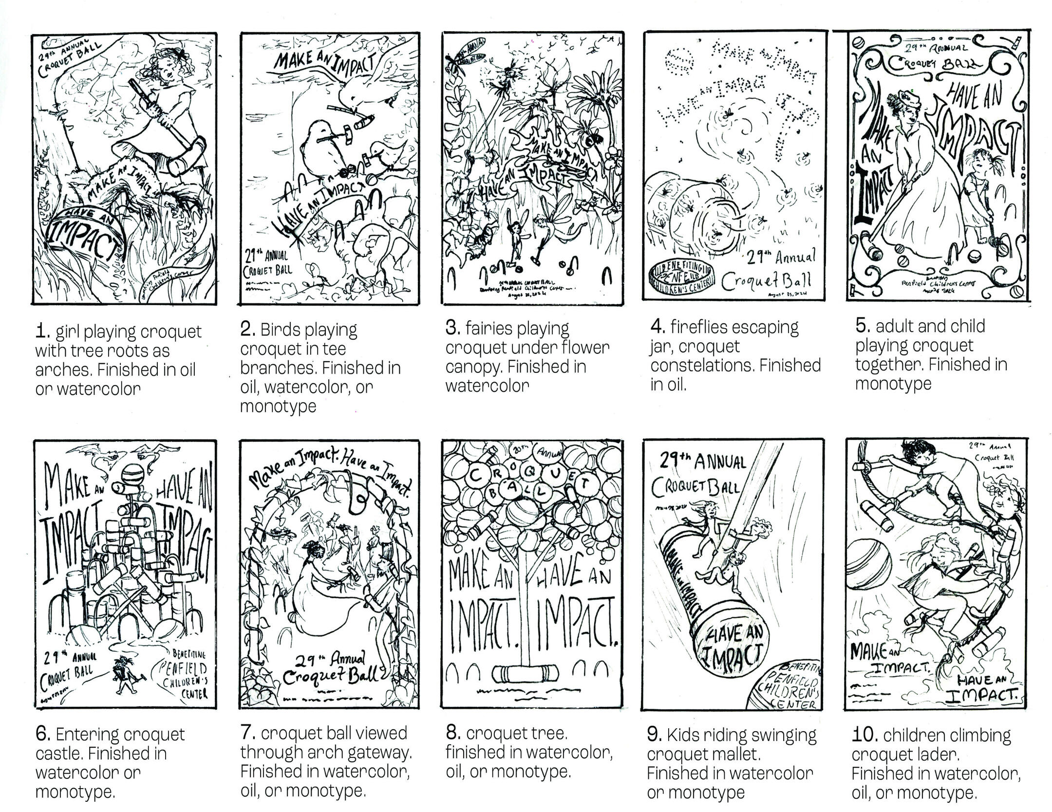
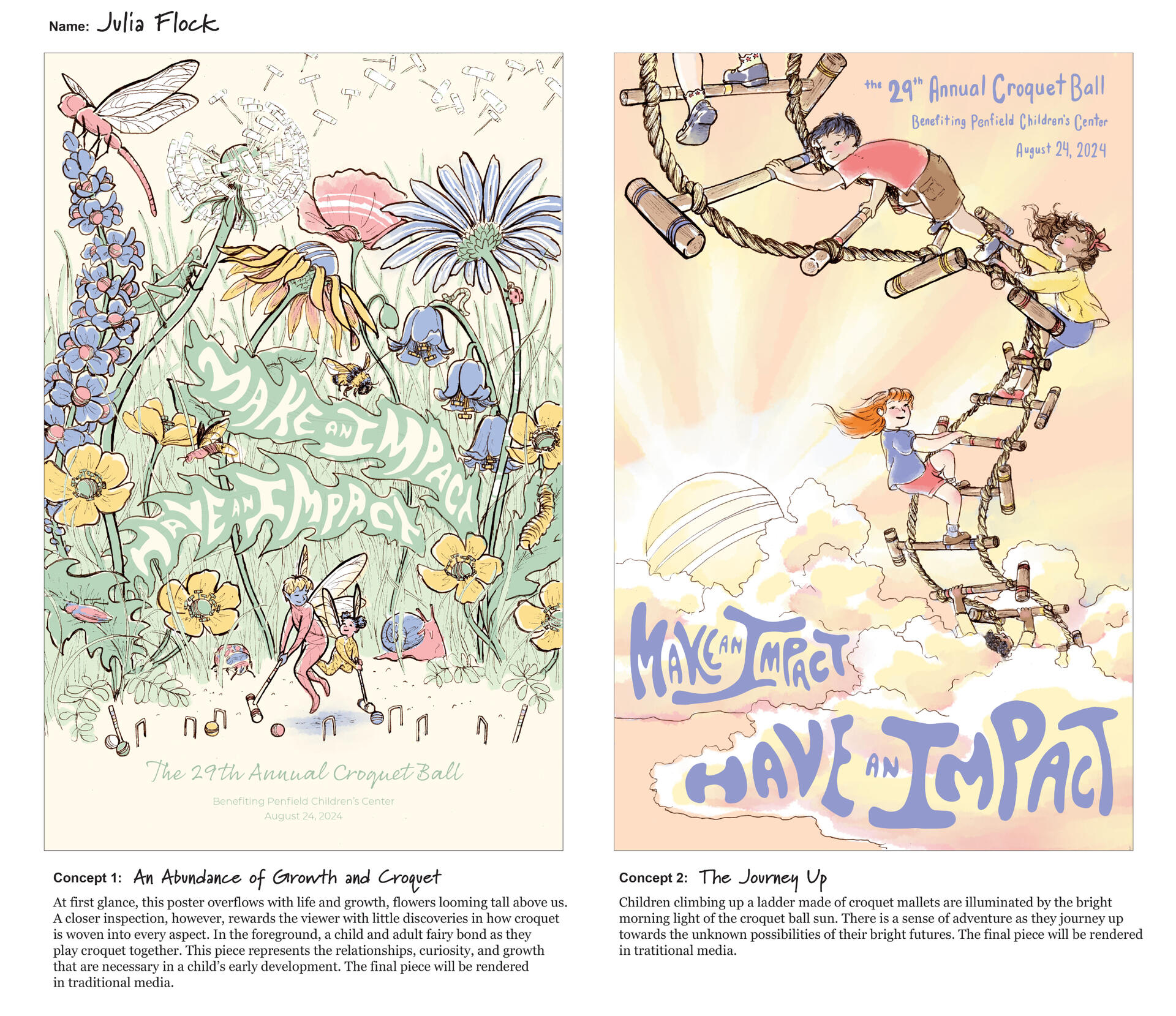
Penfield Croquet Ball Poster
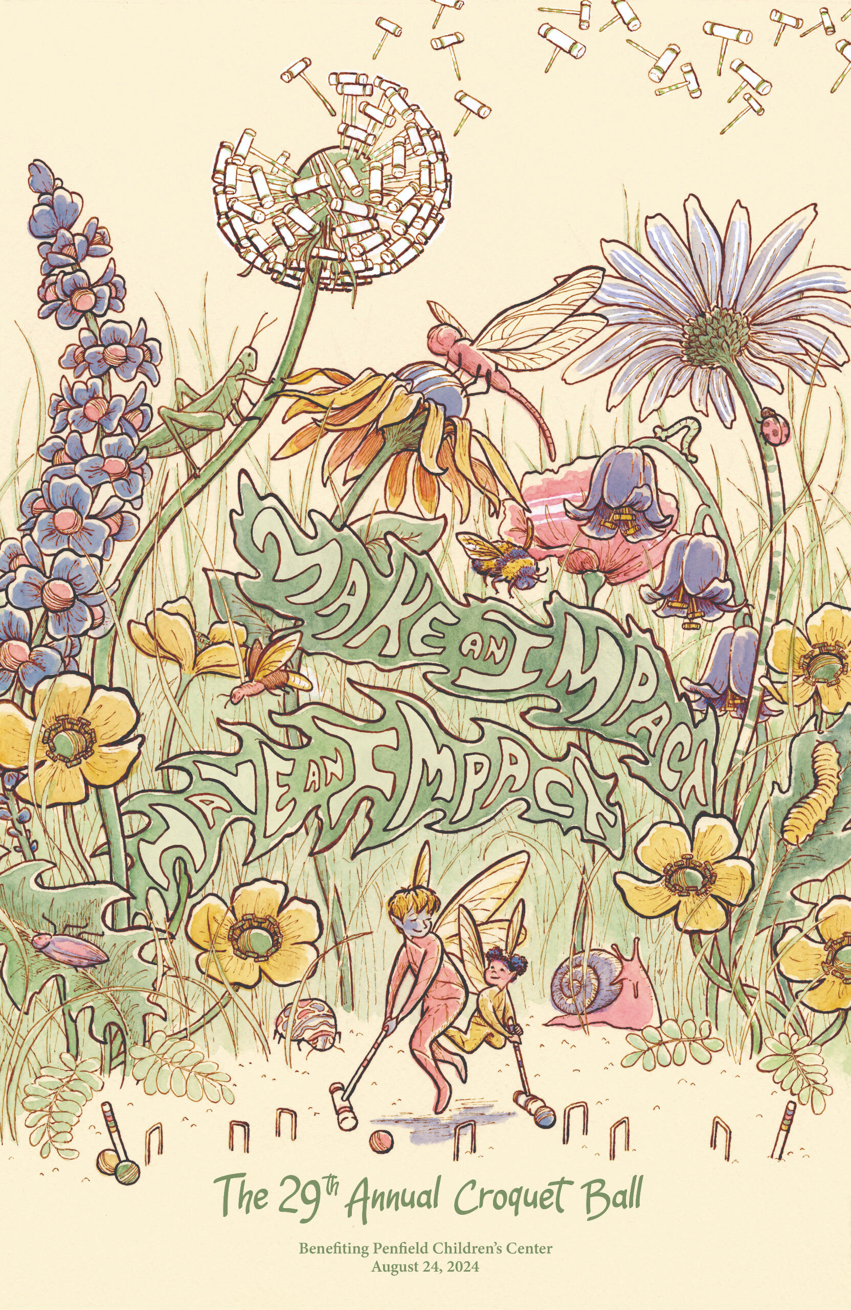
The Penfield Children's Center collaborated with illustration juniors at the Milwaukee Institute of Art and Design to create posters for their 29th Annual Croquet Ball.This piece has been exhibited in MIAD's Junior Exhibition, and has been accepted into the Society of Illustrators Student Exhibition.
Process: Concepts and Tight Sketches
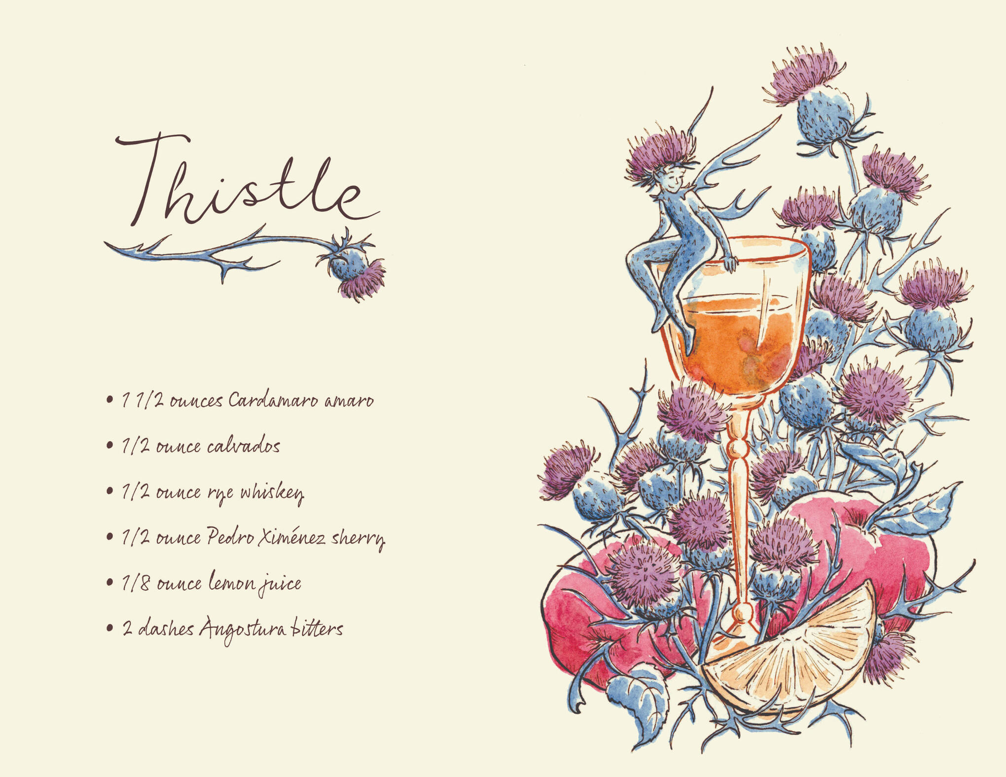
Thistle Cocktail Recipe
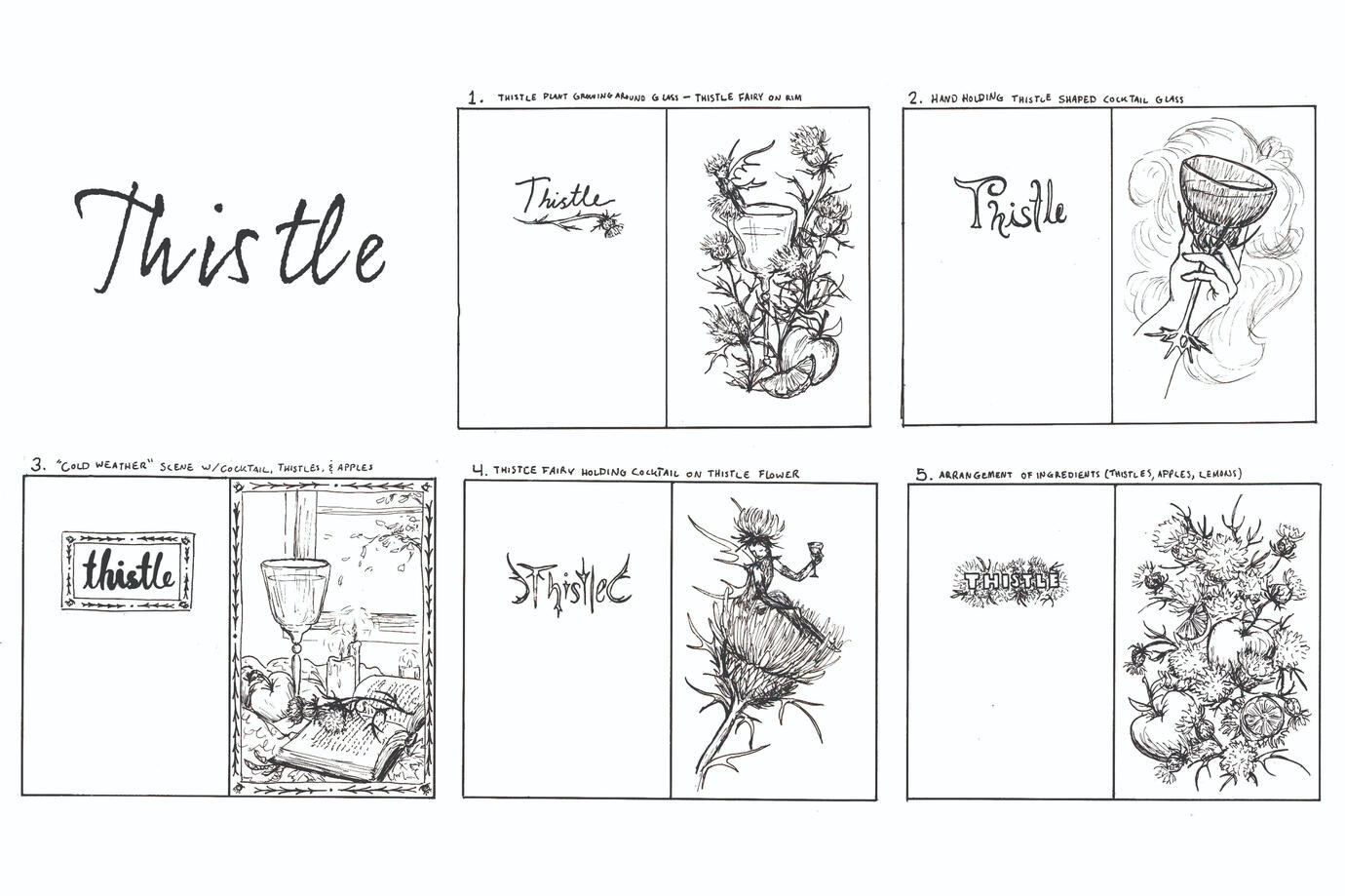
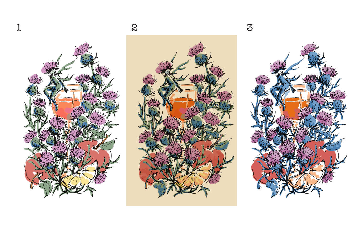
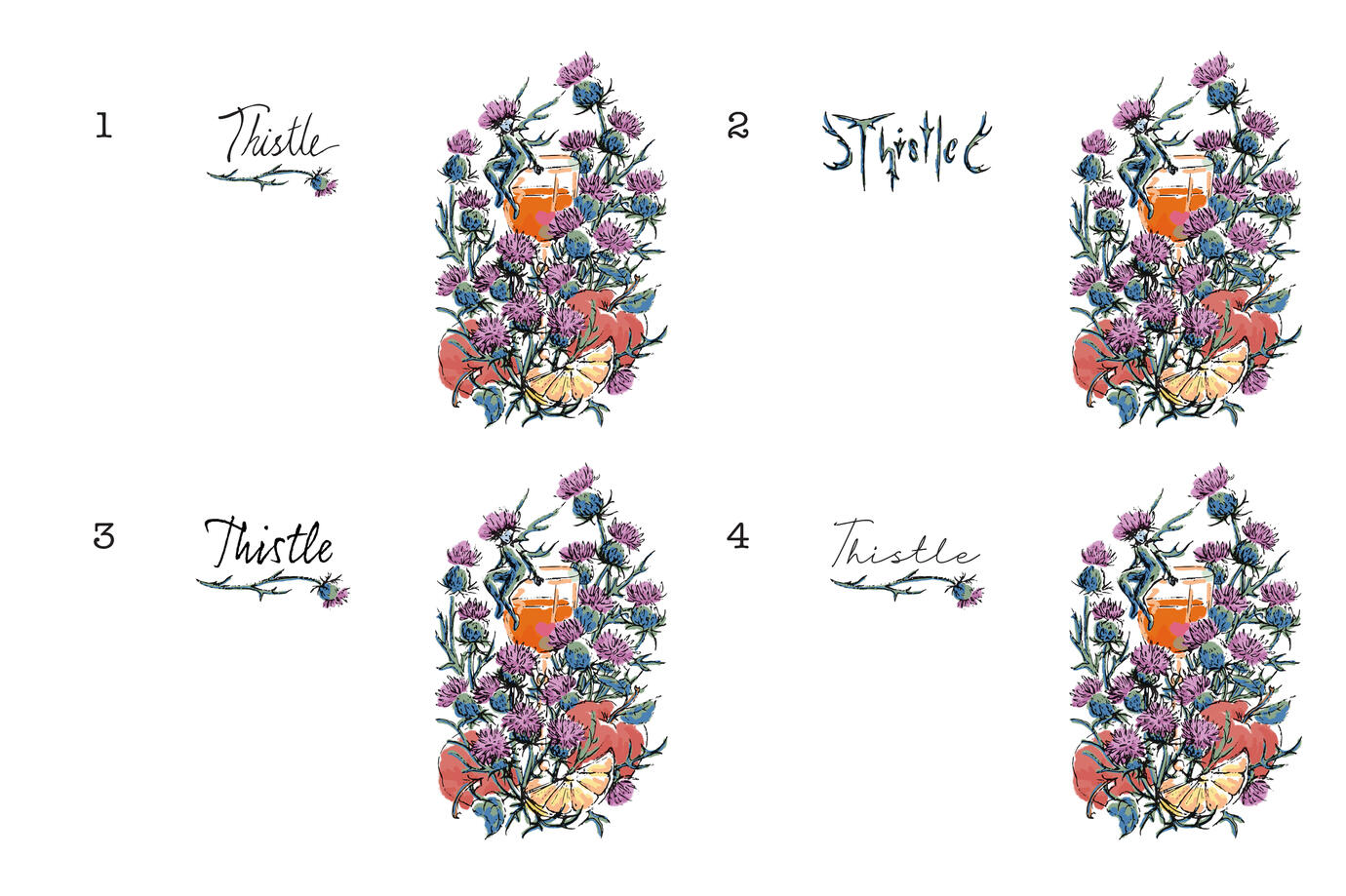
This illustration won one of the spots in the Milwaukee Institute of Art & Design's "Swag Bag" item for ICON12. The cocktail recipe booklet features work from MIAD's Illustration Juniors.Given the cocktail theme, this project was certainly outside my comfort zone, but I enjoyed finding ways to make it my own. The project also required working within the MIAD color palette, which was a fun challenge that pushed me to grow and simplify, and I loved the results.
Process: Concepts, Color Studies, and Tight Sketches
Biking Through Sparta, Wi
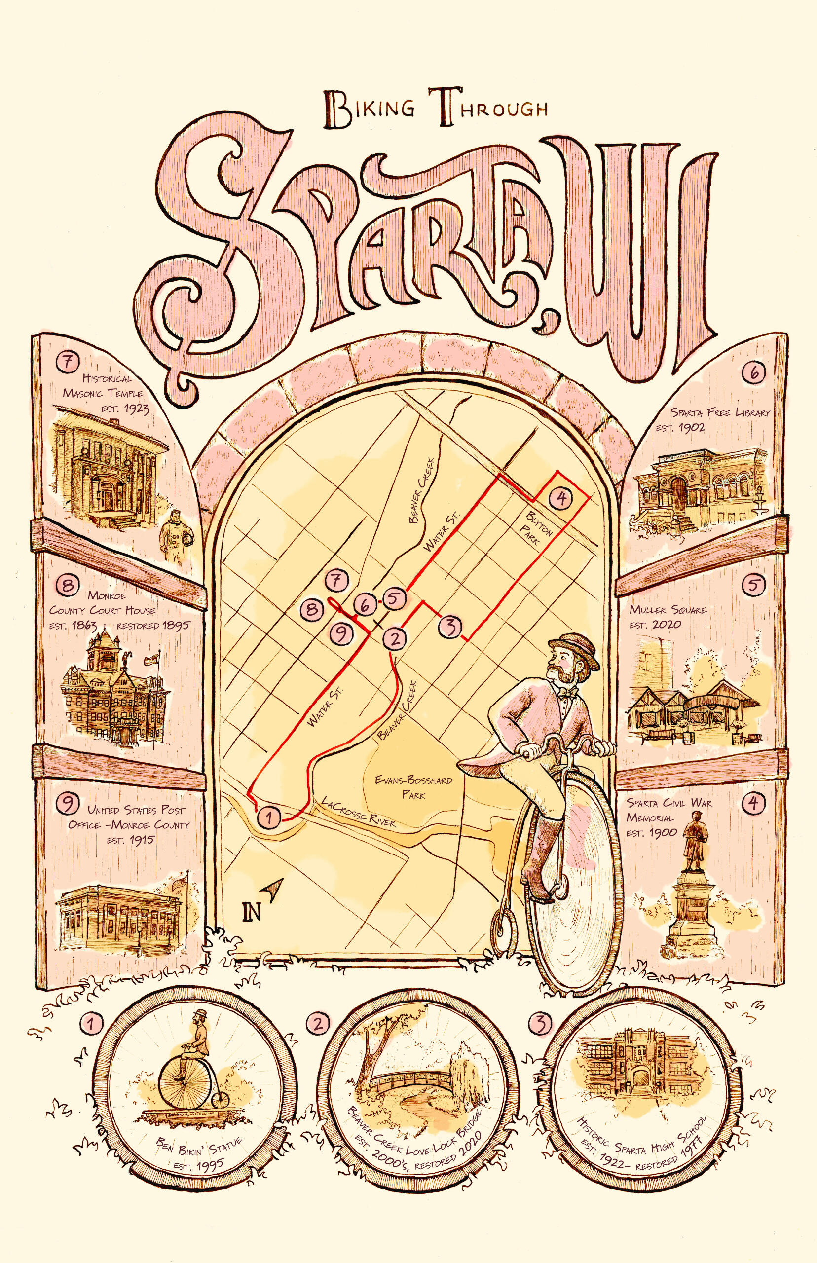
I have always enjoyed doodling maps of imaginary places, but this opportunity to draw my home town proved just as fun!Sparta, Wisconsin is the Bicycling Capital of America, rich with history and beautiful landmarks. I wanted to highlight some of those places in a short little bicycling route I mapped out, connecting to a bike path that travels by the town.The "Rails to Trails" project began on Sparta railroads, causing the "capital" title to be awarded to it. The trail runs through multiple beautiful train tunnels, so I decided to make those tunnels the window through which my viewers will enter Sparta. Our town mascot, Ben Bikin', beckons us in as we explore the scenes depicted in the bicycle wheels and on the doors. The lettering style and detailed line work speak to the history of Sparta, with soft reds and golds subtly infusing the composition with the town's colors.
PB&J - boat logo
I loved working on this logo; the name is adorable and lends itself to so many great possibilities, and it challenged me to simplify my work like I never had before. Finding my way around the vector tool and playing around with typography and a variety of ideas came with so many learning opportunities. The letterforms were especially fun as I explored using other typefaces and creating my own.
Process: Concepts and Revisions
The Second Iteration
Lazy Yellow Moon
When my clients returned asking for another logo, this time for the Lazy Yellow Moon, I got to explore a different set of challenges. This time I was given a photo reference to work off of, challenging me to maintain the clients' vision while also making it my own work, adjusting and adding trees to make it their perfect logo.
Process: Concepts
Community Preschool of Whitefish Bay - logo
The Community Preschool of Whitefish Bay asked me to create the illustration component of their new logo for their updated brand.I was recommended for this job because of my interest in children's book illustration, so creating something that represents the joy of kids is right up my alley! This project challenged me to simplify my work so that it can work on a small scale while also maintaining the little narrative details that celebrate a variety of things children love to do in school. Working on this professional project, exploring different directions, and making revisions helped my work to grow in new and exciting ways.
Process: Concepts and Revisions
Click on any image to discover more about the story!
The Cardboard Castle of Boxdom Wood
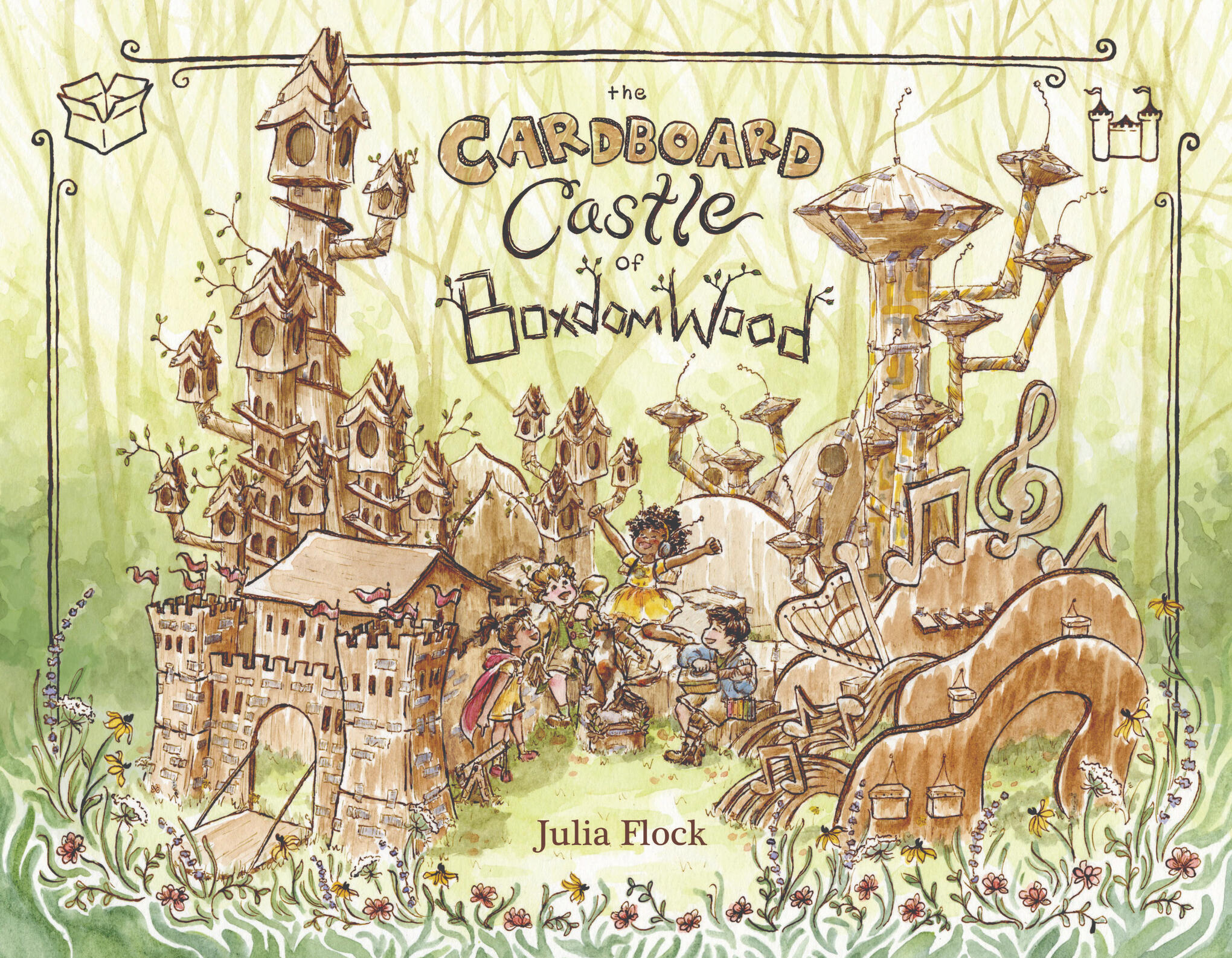
The Cardboard Castle of Boxdom Wood is composed of two parts, meant to encourage children aged 5-8 to embrace creativity and uniqueness in themselves and others. The story of the book follows four friends as they try to build a cardboard castle together, each with very different ideas of what it should be. After the conclusion of the story, each of the characters presents step-by-step instructions for replicating something they built in the book, providing an opportunity for readers to really engage with the story and discover their own creativity.This project was exhibited in the MIAD Senior Exhibition, winning one of the Senior Thesis Awards.
Click to enlarge
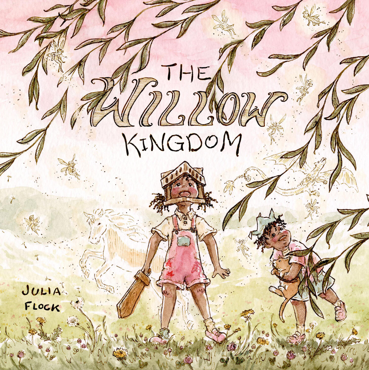
The Willow Kingdom
The Willow Kingdom, told in verse, follows the story of an adventurous little girl with a big imagination and a love of knights, who wants to find a place to play without her little brother. By the end of the story, the girl discovers that her brother is a necessary part of her kingdom, for what is a knight without her king?
Click to enlarge
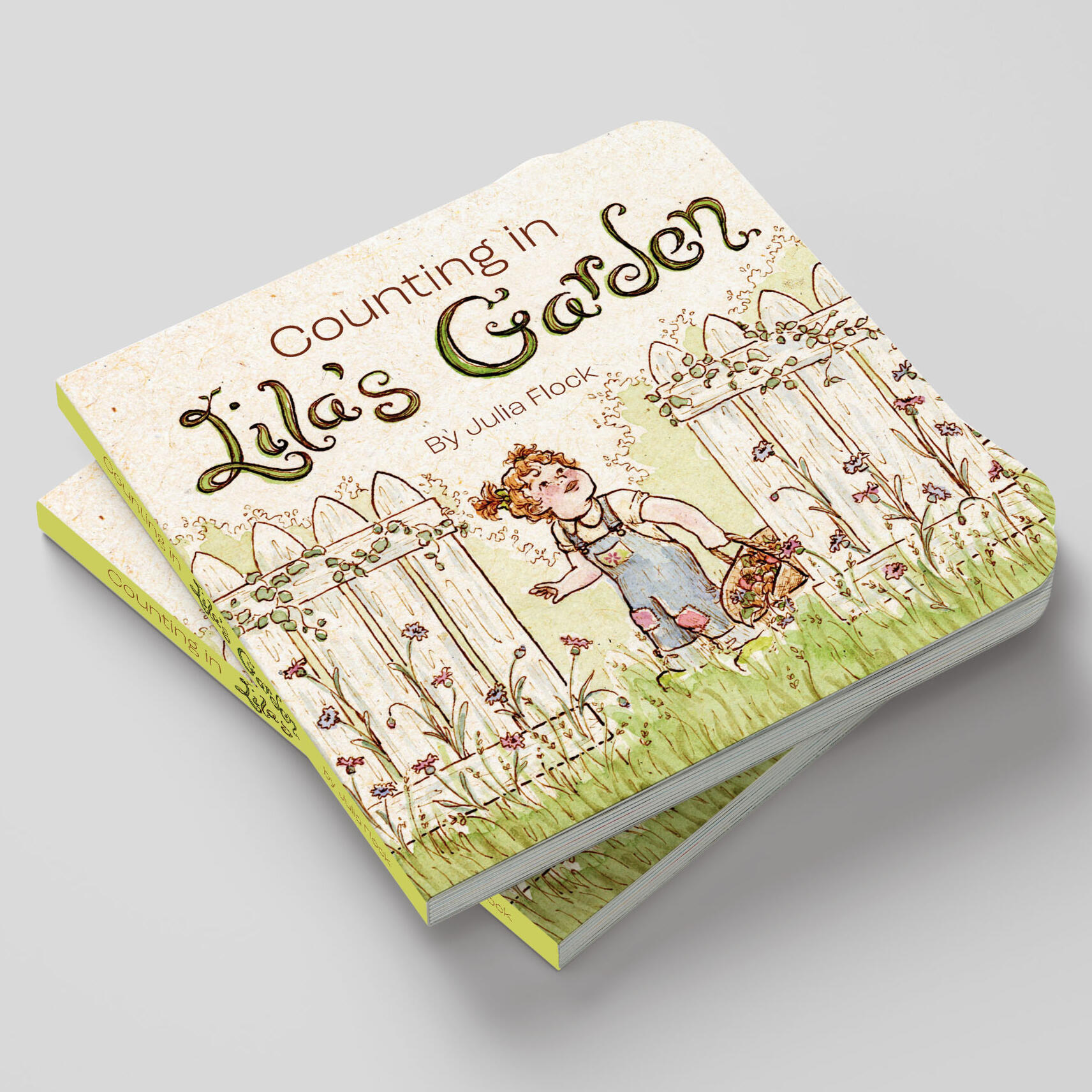
Counting in Lila's Garden
With wonder filling every page, Counting in Lila's Garden is a board book for pre-k children learning their numbers. Lila counts the things she discovers in the garden in a rhyming pattern that lends itself to read-aloud.
Click to enlarge
In the Shell of a Life Passed
This unique, hand-bound book was made in Ireland as a part of a month-long study abroad program during the summer of 2023. During that month, I fell in love with both the country itself and the people that inhabit it. I met so many people as I conducted interviews as part of my research for this project, and I poured all I learned from them into this book.Process
The illustrations were created with transparent monotypes layered over detailed dip pen and ink line work, to recall old books of fairytales. The cover is made with two pieces of soft faux leather carefully hand-sewn together, printed on the letterpress with oil-based shimmering gold ink using a photopolymer plate. Pieces of handmade paper attach the cover to the interior pages. Both of these sheets were made with mixture of recycled paper, sea spinach, and jean material, sprigs of Germander Speedwell pressed between two very thin layers for decoration.
Concept
Upon stepping foot outside the airport in Shannon, Ireland, the first thing I registered was the intense smell of green, of nature allowed to run wild in full bloom; the scents of life that had been here for a very, very long time. The second thing I noticed was what seemed to be the very opposite of that green smell: old stone walls that were evidence of human interference going farther back in time than anything I had seen before. Going into this project, I was asking questions about the relationship of nature to architecture, and the philosophical meanings that can be attached to the story of that relationship. I wished to discover whether the way nature has been allowed to absorb human architecture and history is a dishonoring act of forgetfulness or a beautiful healing of wounds. That was the beginning of the conversation: a question so big it sought to encapsulate the whole of the past and the future. But what this project became for me is the journey I took as I learned to ask questions about the present.I wanted to tell Ireland’s story, even if I could only capture only the smallest, vaguest hint of what there is to tell. But in many ways, I was asking the wrong question entirely; my question was too deep in the past and too far in the future. The questions that need answering are far more immediate, questions that concern people right here, right now, trying to live their lives. We need to ask questions about how to preserve nature and history, and how we can find space to thrive in the shell of a life passed.
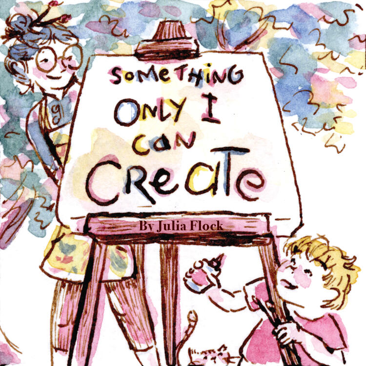
Something Only I Can Create
The idea for Something Only I Can Create is inspired by my experience with my own little brother; the book I wish I would have had for him back when he felt just like the little boy in this story.These illustrations are only tight sketches, when I complete the book they will be more refined, though I will be using the same medium of watercolor washes over dip pen & ink line work.Usually when doing tight sketches, I work full size, starting with a light pencil drawing and using some quick digital editing to make the line work more clear and provide a sense of the color direction. This way I am generally able to simply make the necessary adjustments and continue working on the same piece of paper to execute the final artwork. This not only saves time, but also preserves a little of that natural flow that often gets lost on pieces that are over worked.
Here, however, I took a different approach, working very small (at only 2''x2'' pages) and jumping straight to my final mediums. I then scanned them in at 300%, with text added in Adobe Illustrator. While I certainly do not consider these to be final, there is something in the looseness that happened when blowing up my work to a larger scale than I worked at that I would like to explore in the future. Most illustrators find that working large scale and shrinking down from there is useful when working traditionally, but I have discovered that, since my instincts already have me focusing on tiny details at a small scale, my work actually can benefit from the opposite. 300% might be a bit too much, but 150% might prove to simply enhance the textures and variations that make traditional work so beautiful to me.
The Roadside Wildflowers of Wisconsin
This is one of my first self-published books, a little portfolio of simple flower illustrations along with there common and scientific names, organized by color.You can find it on Amazon here!I absolutely love wildflowers and learning the names which belong to those specks of color which make the roadsides come alive with magic and possibility. Eventually, I plan to continue this project, recording as many of Wisconsin's wildflowers as I can find.
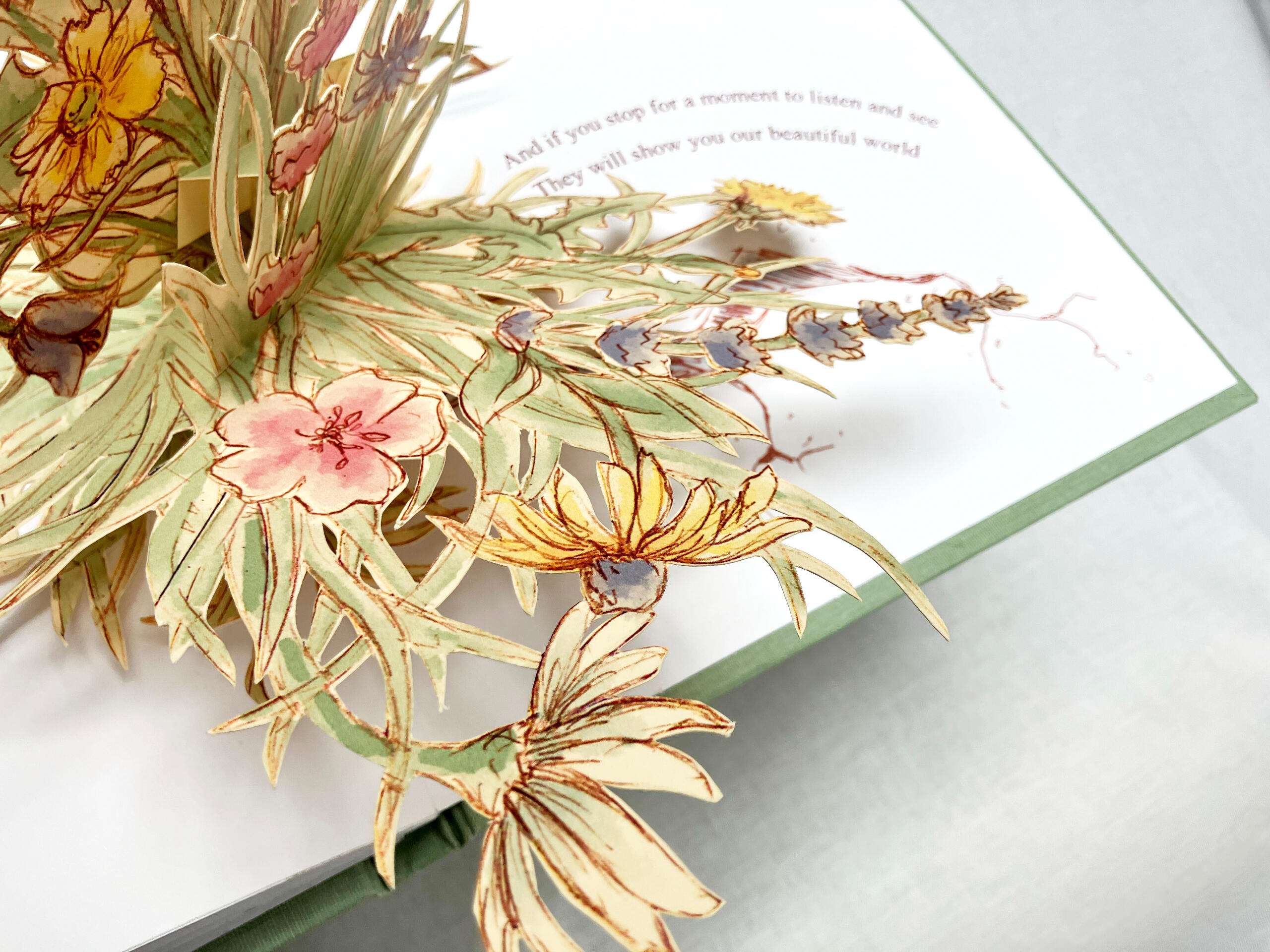
Some Flowers
Interactive books were always my favorite as a child. I love devising ways for the world of my illustrations to jump off the page and into the our world!
Some Flowers.Some flowers grow on bushes so big
Surrounding our homes like green walls
And butterflies land on the clusters and sprigs
That hold many creatures so smallSome flowers are rare and precious as gems
Kept under glass or in wilds far away
With delicate petals and the most fragile stems
Admired on the stands where they staySome flowers are bright and loud and bold
Standing tall as they reach for the sky
At a distance they still are a sight to behold
As they wave from their rows, never shySome flowers are tidily planted in pots
Bringing color wherever they’re set
So we bring them inside to brighten the spot
Where we will see them and never forgetBut some flowers are wild and messy and free
Sprouting up from the cracks in the road
And if you stop for a moment to listen and see
They will show you our beautiful world
The Adventures of Fishy & Fish
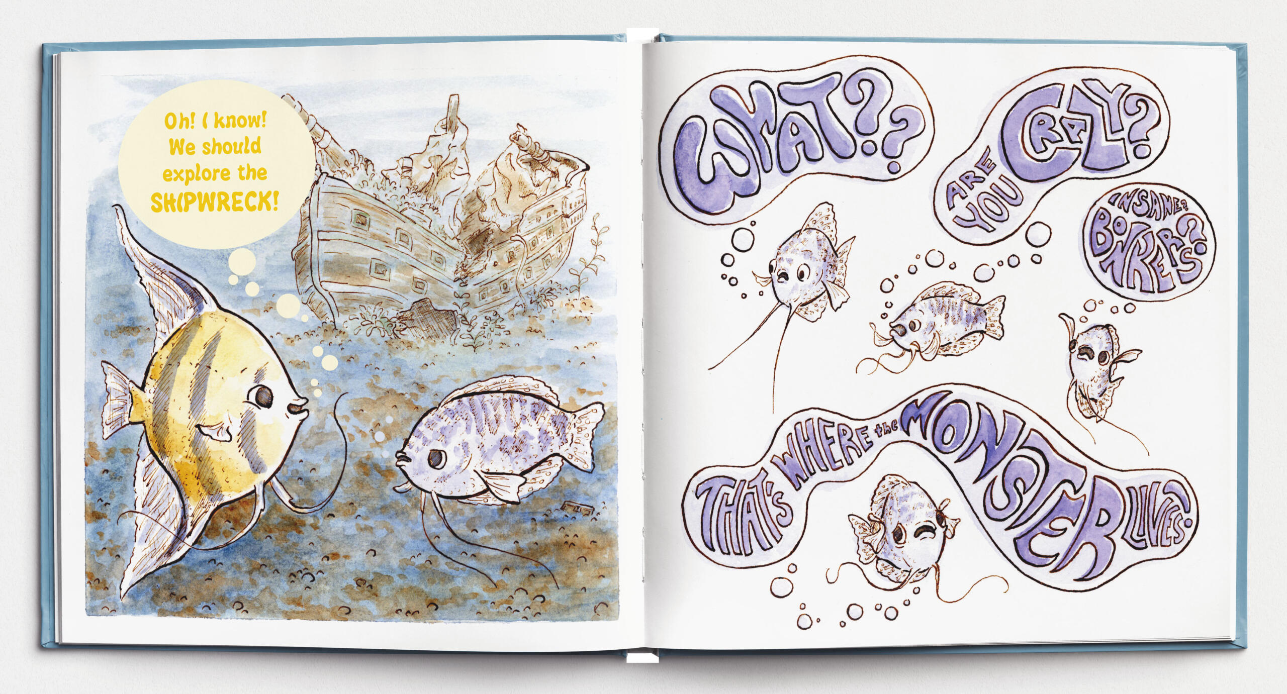
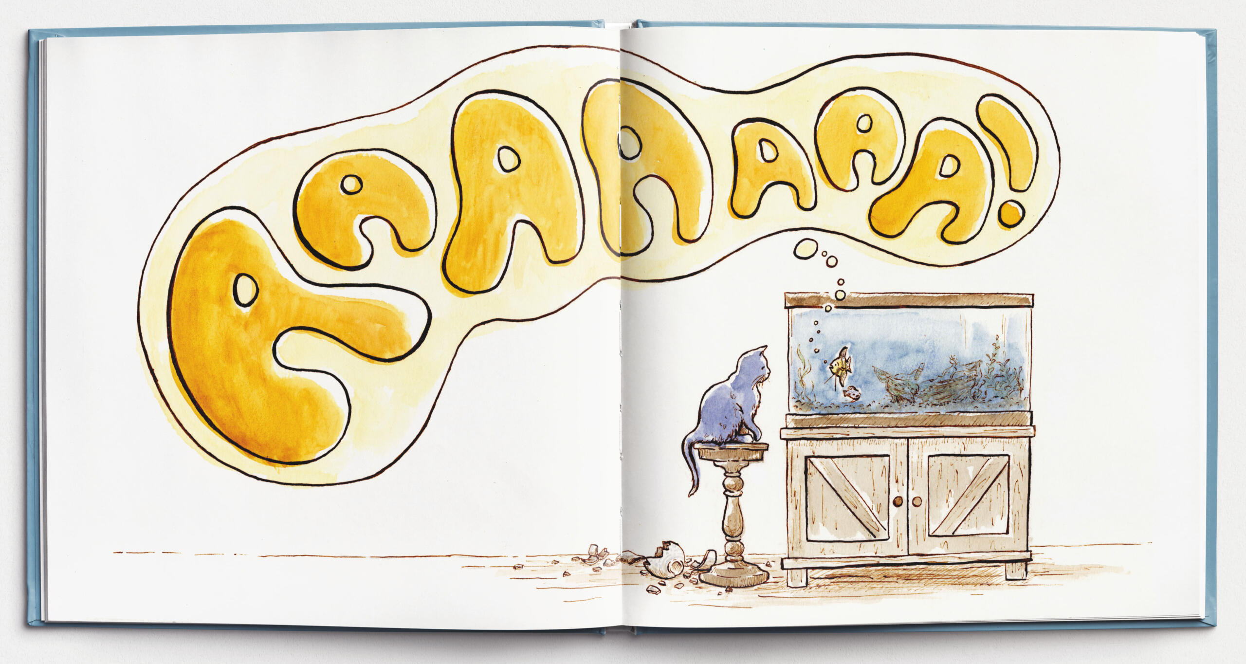
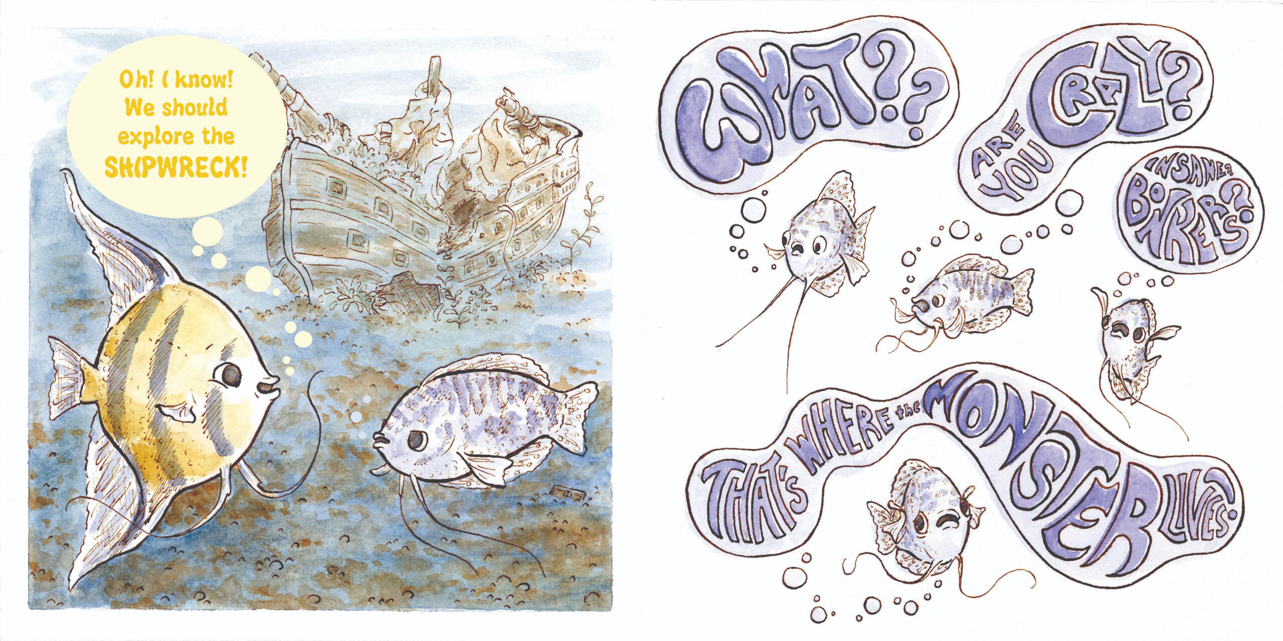
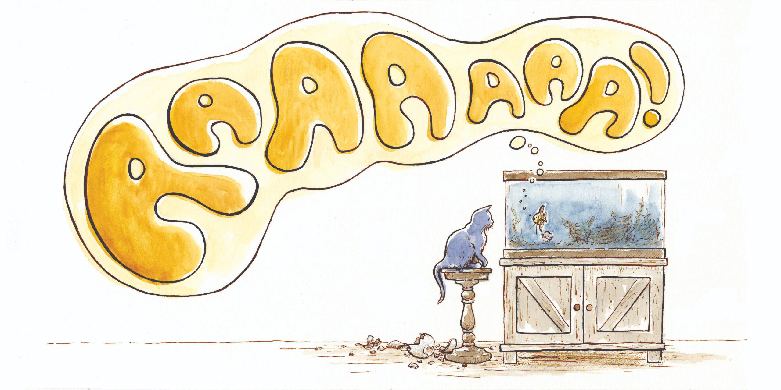
Meet Fishy, the outgoing, fun-loving, adventurous Angel Fish, and Fish, the realistic, introverted, worry-prone Gourami!A recent picture book series idea I am beginning work on is inspired by my family's pet fish, which my brother has named "THE Fishy", "Fish", and the elusive "Fluffy". As we have watched the actions of the real fish, distinct personalities have emerged, and there have been many, many silly conversations in which we have narrated their thoughts.In this series, I want to embrace the silliness of the stories we tell each other and communicate the wide variety of emotions we imagine for these fairly inexpressive creatures is a new, lovable way. I balance the details and mediums I love with simplicity of backgrounds and a variety of formats that tell a dynamic story.I still have a long way to go, and the typography needs work (I may have gotten a little carried away with Fish's outburst), so I have quite the adventure ahead of me!
Some of my favorite sketchbook pages; I am constantly creating images using ink and watercolor.
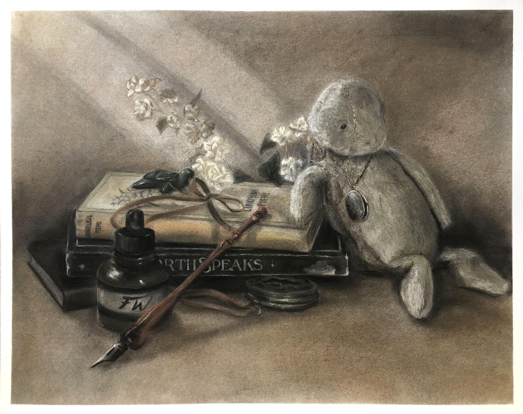
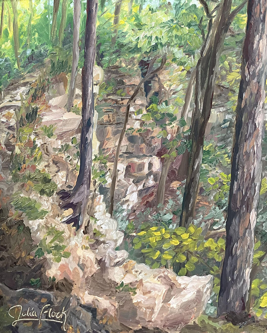
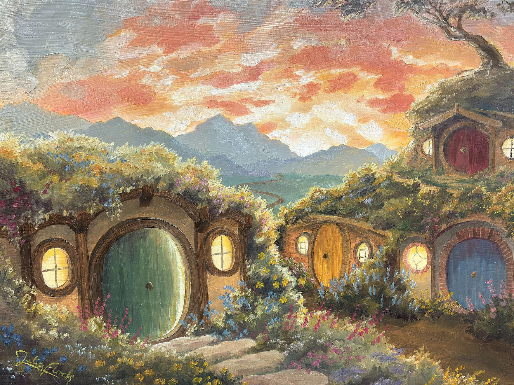
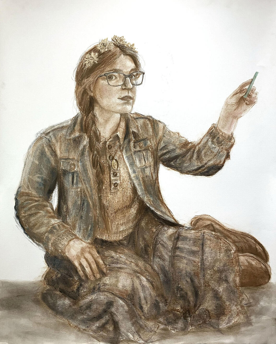
In addition to illustration, I have always loved creating art for the sake of art! If you are interested in buying a print or would just like to hear the story behind a piece, feel free to send a message to the email at the bottom of the page!
Click to enlarge

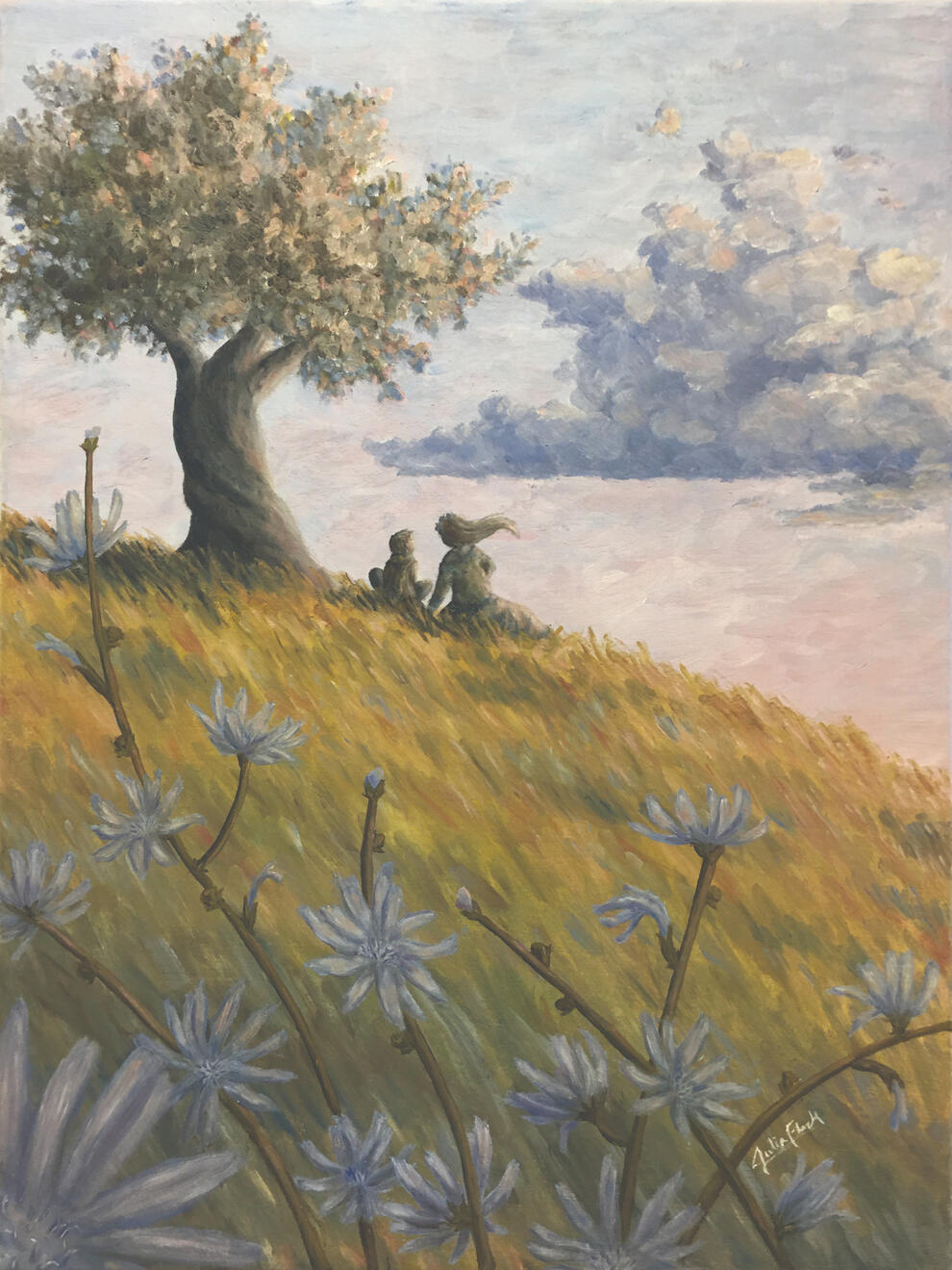
Pretend
oil on canvas
24"x18"
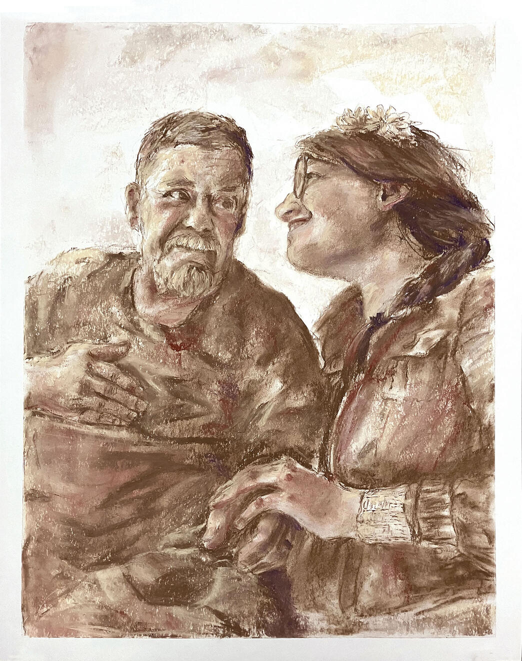
A Grandfather's Love
chalk pastel on paper
24"x19"
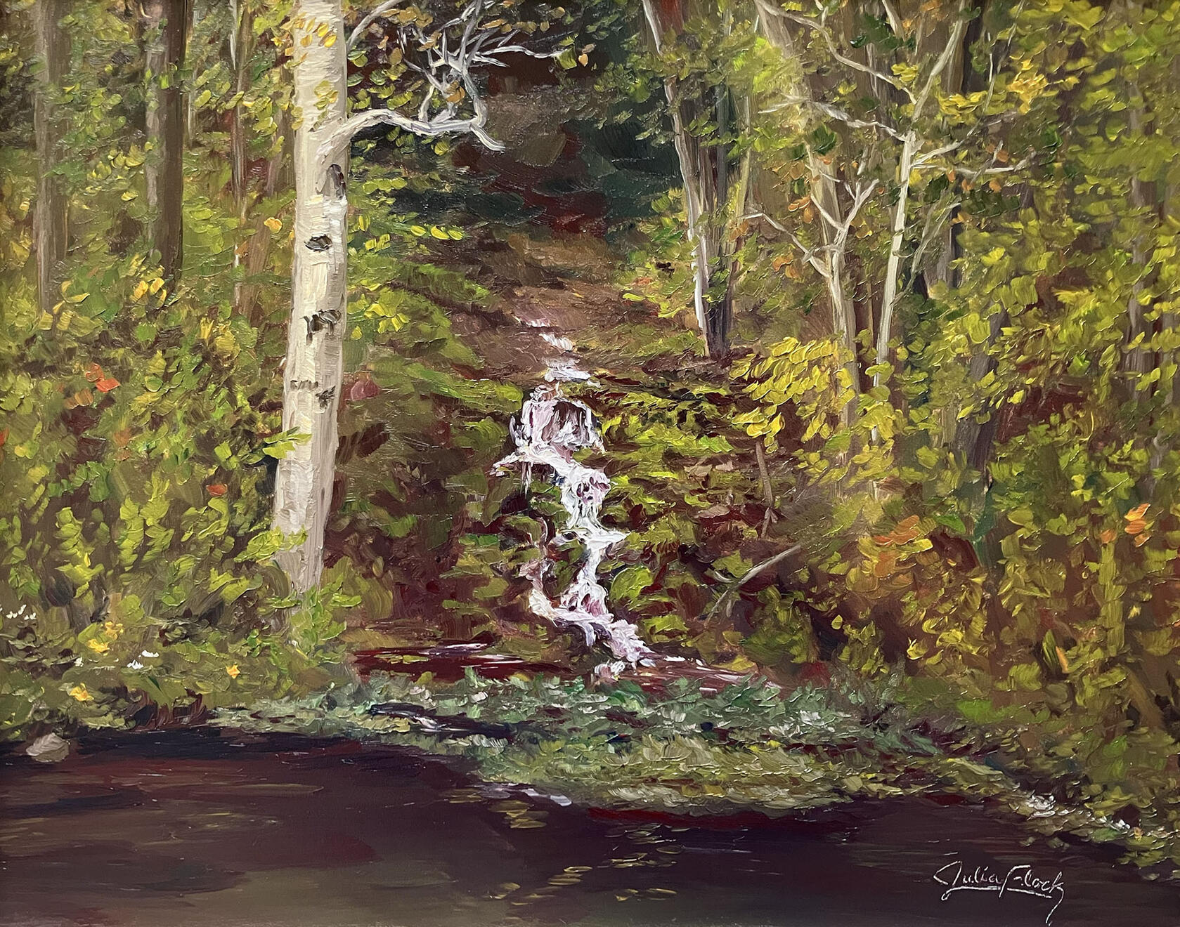
The Silver Spring
oil on panel
11"x14"
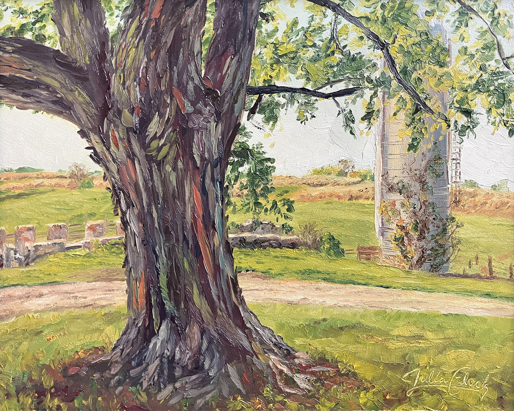
Great Tree on the Farm
oil on panel
8"x10"
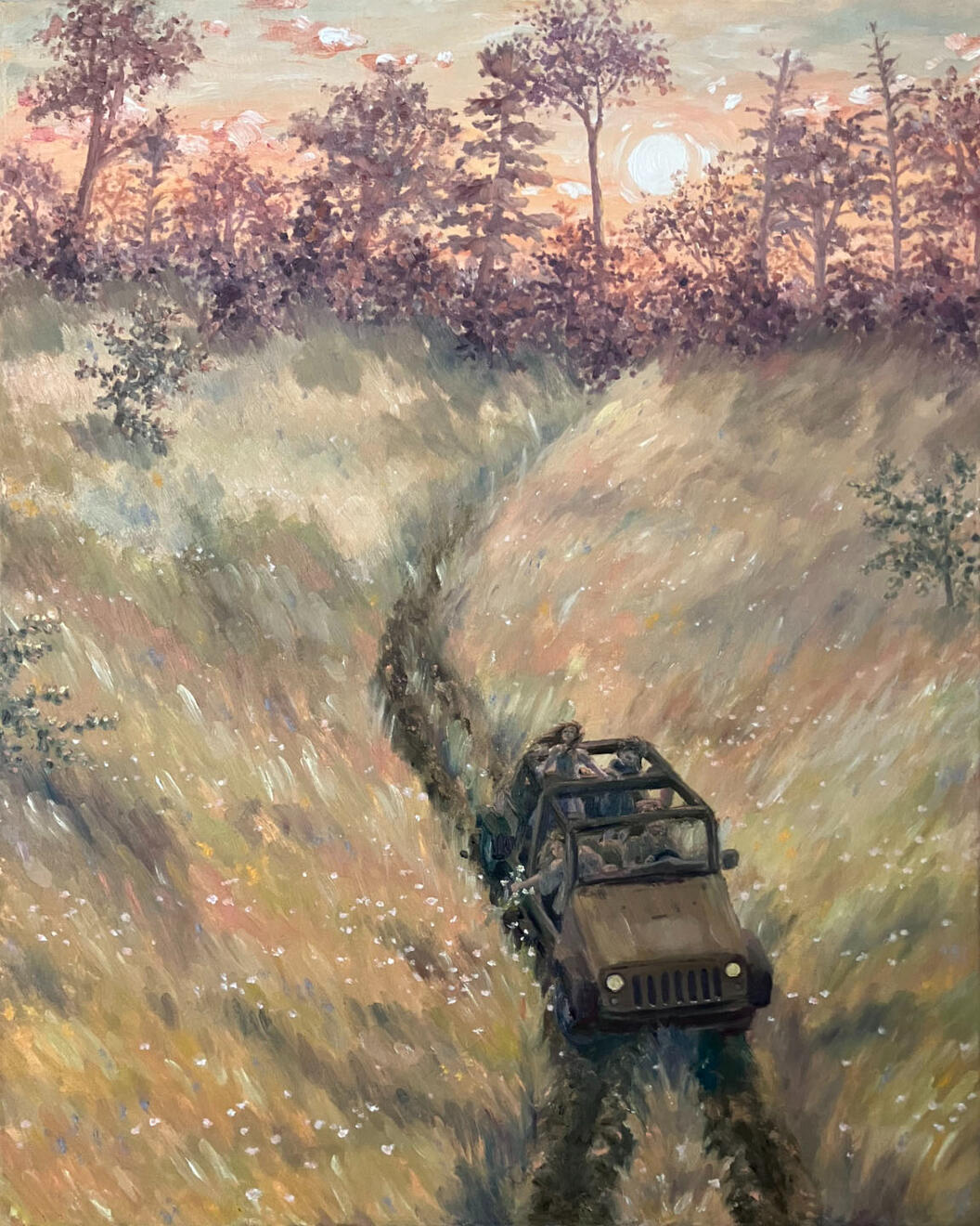
Sunset Jeep Ride
oil on canvas
20"x16"
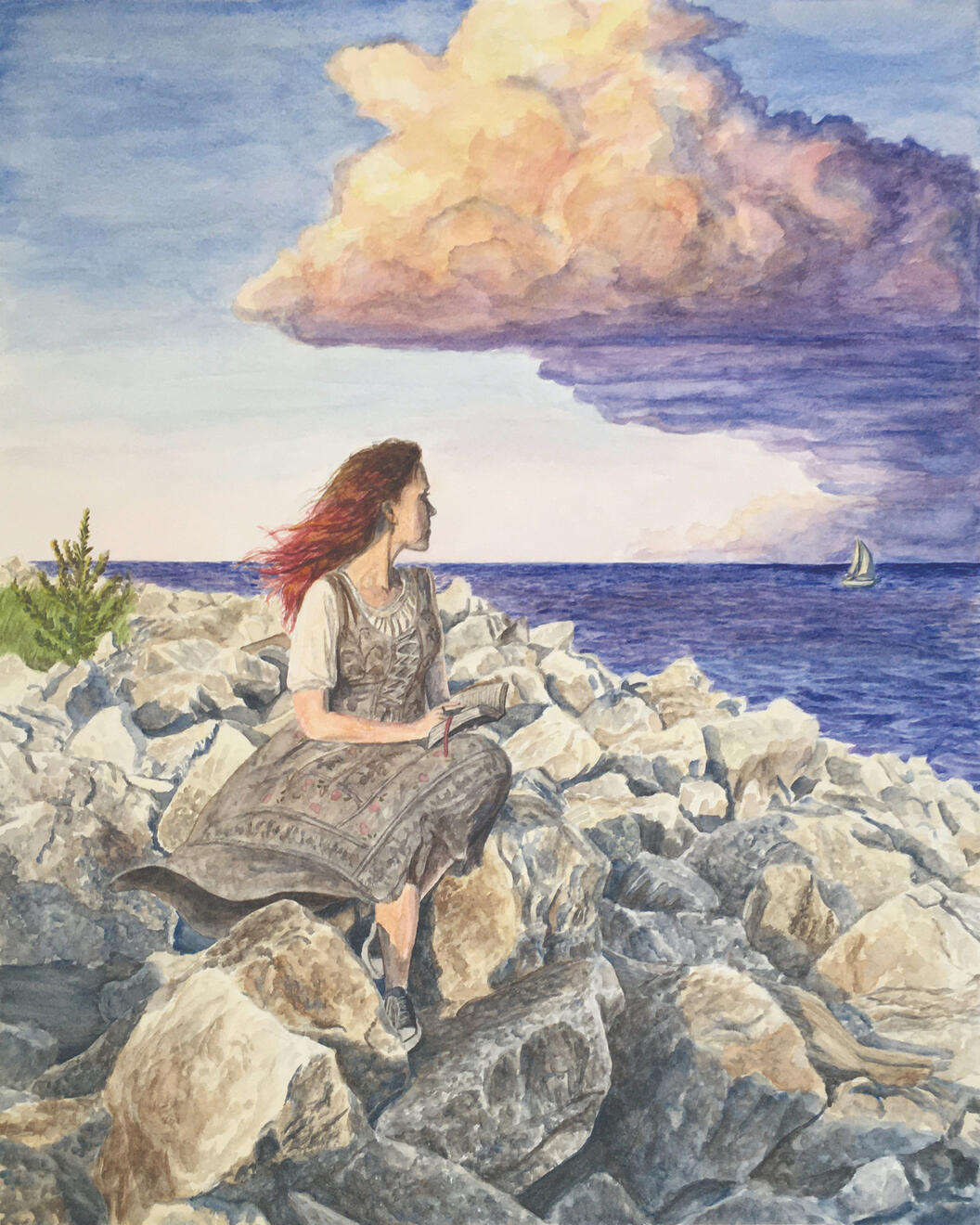
Beyond the Horizon
watercolor on paper
20"x16"
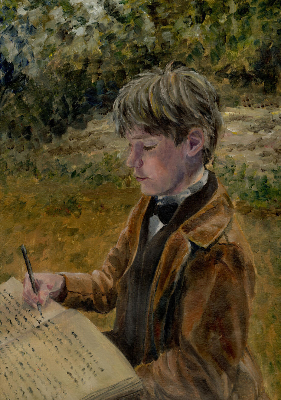
Nathan, Age 10
oil on paper
15"x11"
The Reader
oil on panel
14"x11"
Remember
charcoal & chalk pastel on paper
19"x24"
Off the Beaten Path
oil on panel
10"x8"
Sunset in the Shire
oil on canvas
12"x16"
Self Portrait in Chalk
chalk pastel on paper
4'x3'
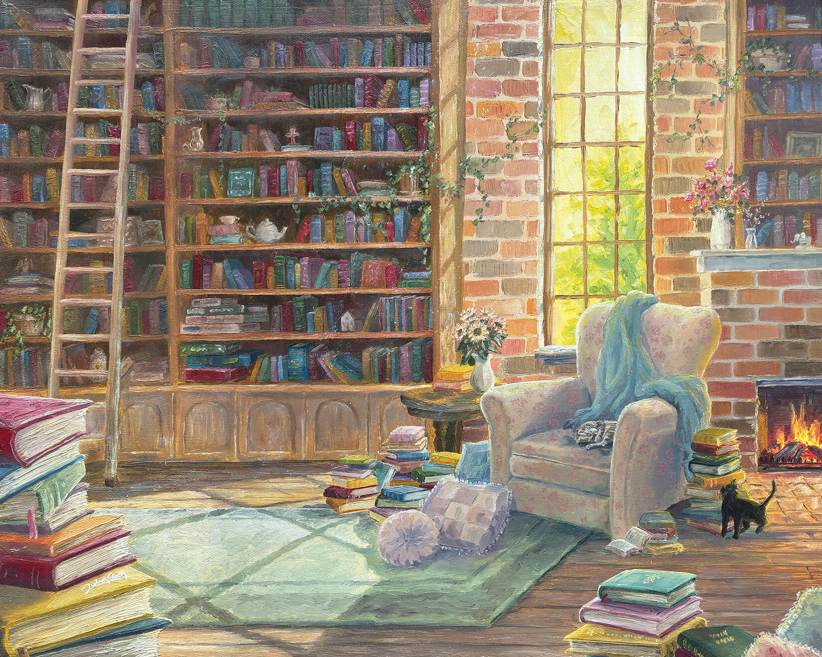
A Room Full of Books
oil on canvas
16"x20"
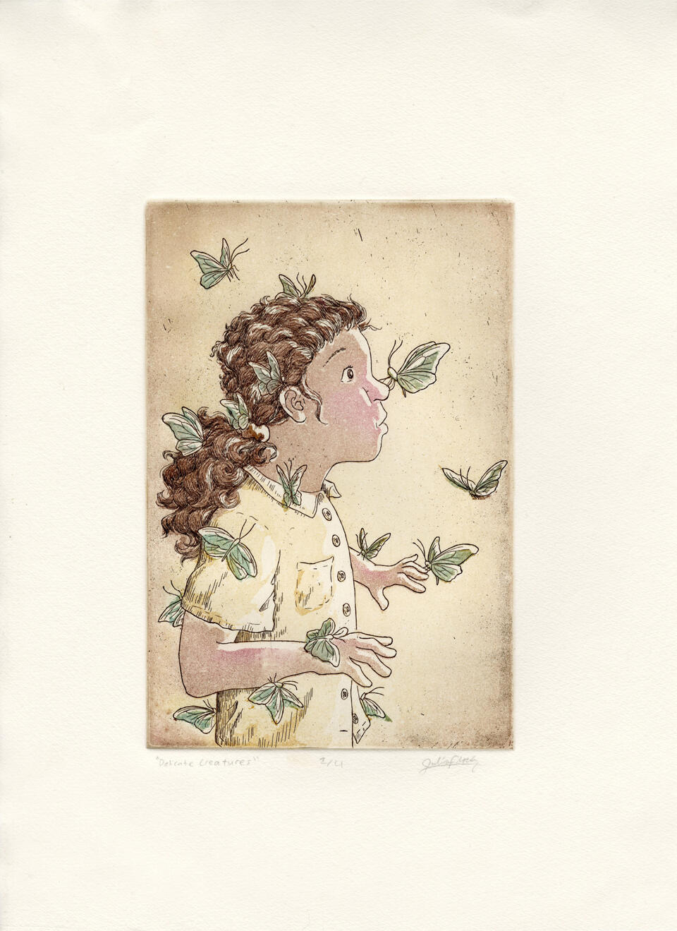
Delicate Creatures
etching on steel
6"x8"
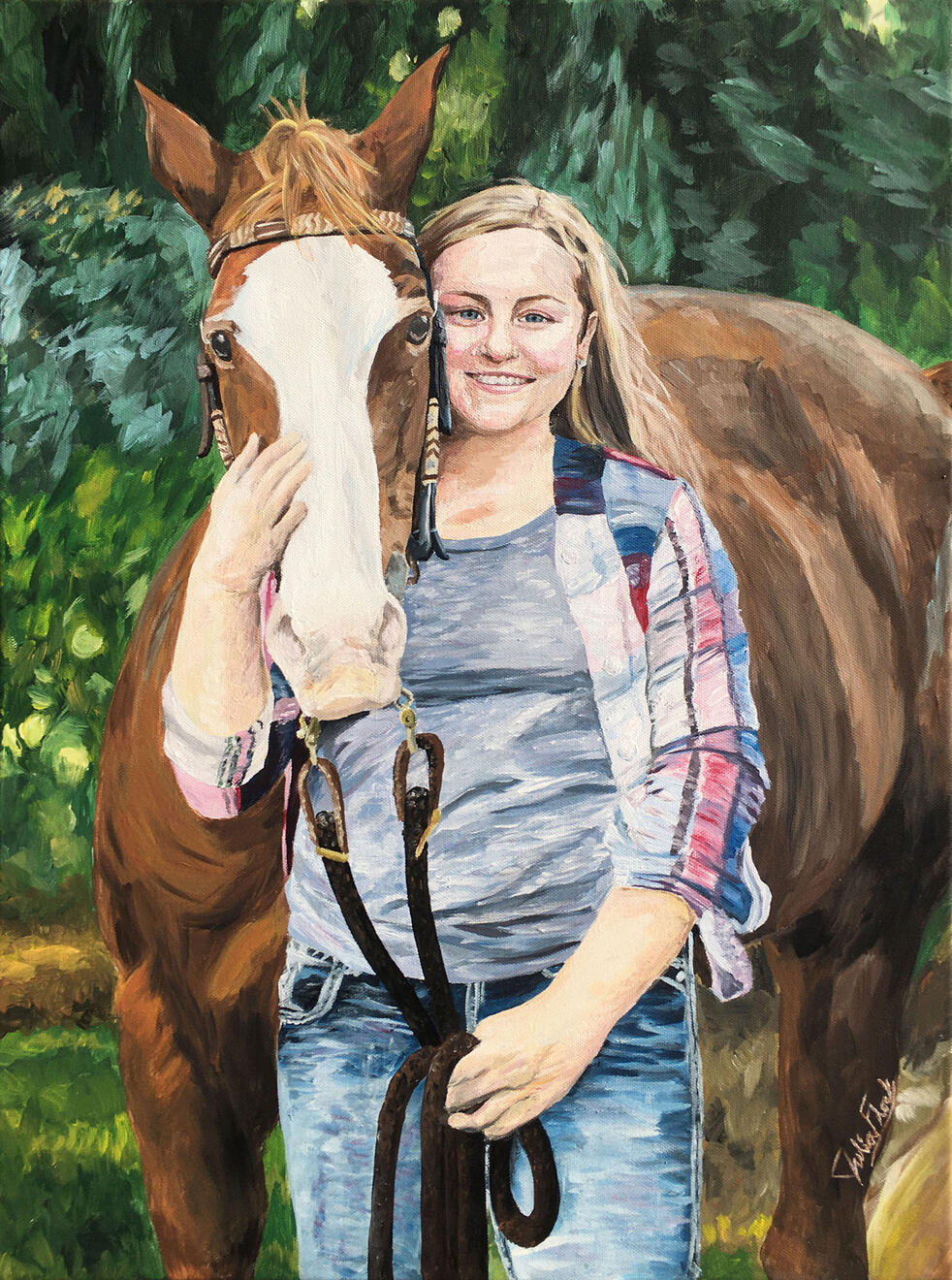
A Girl and her Horse
acrylic on canvas
24"x18"
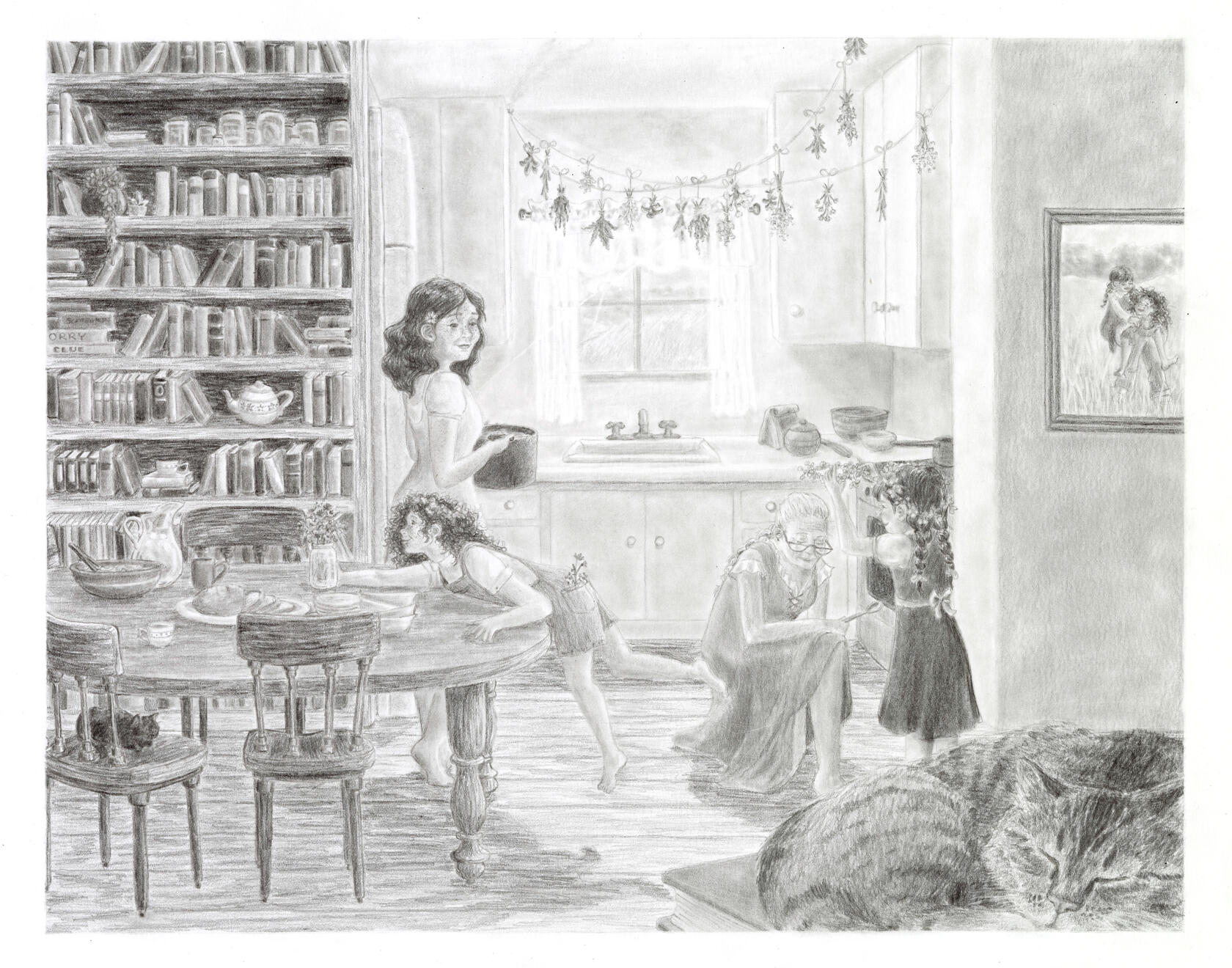
Dinner at Grandmother's
graphite on paper
11"x14"
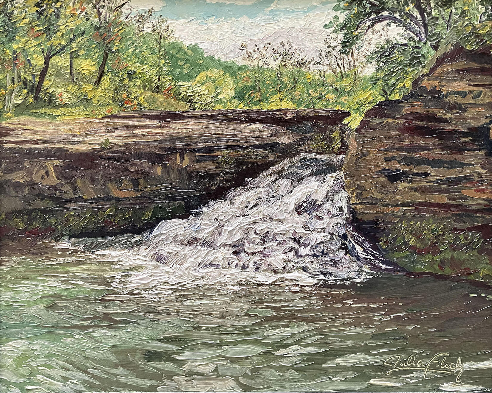
Como Falls: Hidden Gem
oil on panel
8"x10"
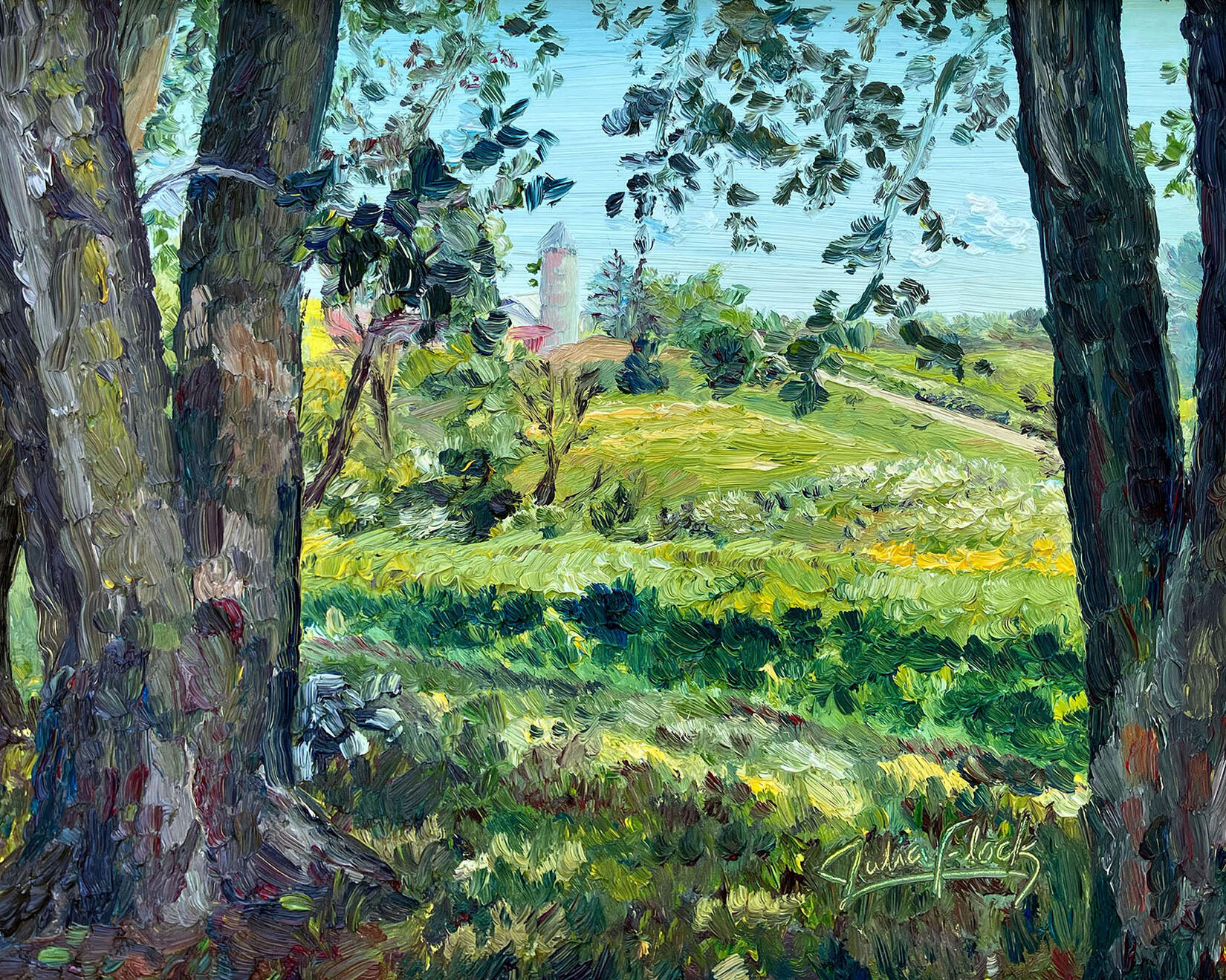
St. Mary's Ridge
oil on panel
8"x10"
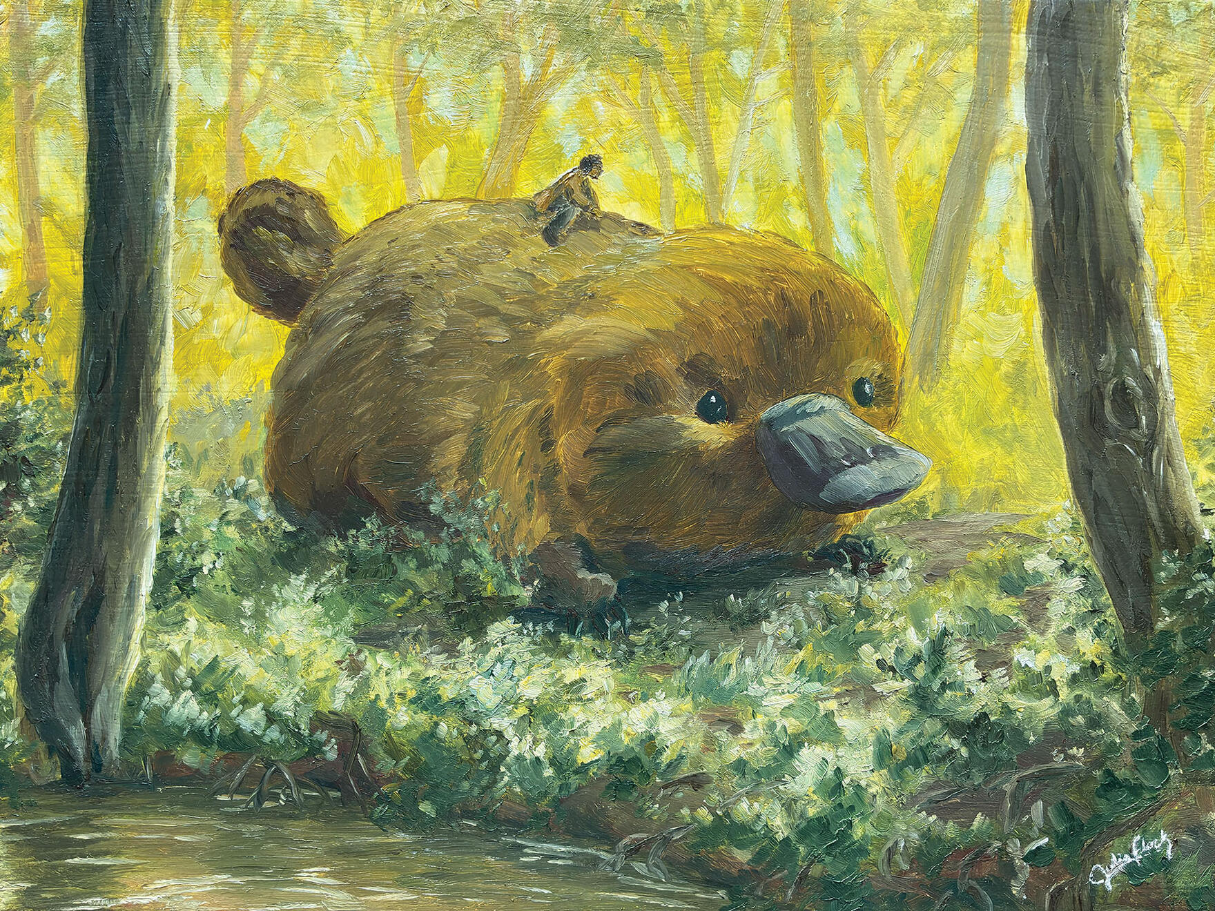
Nathan Riding a Giant Platypus Puggle
oil on canvas
9"x12"
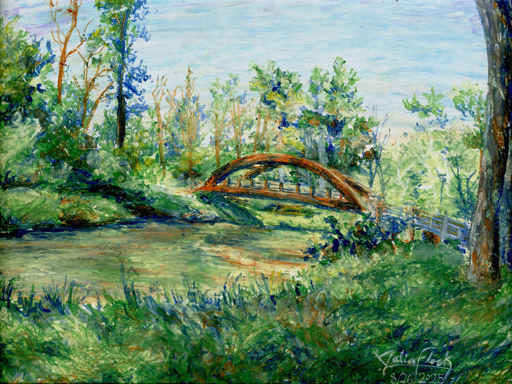
Perfect Morning by the River
oil pastel on paper
9"x12"
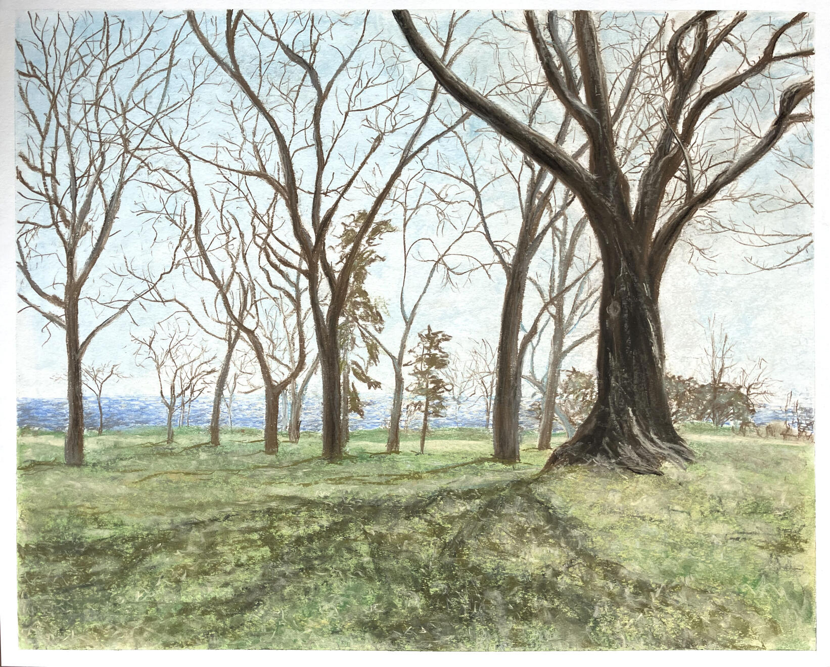
Plein Air in McKinley Park
chalk pastel on paper
19"x24"
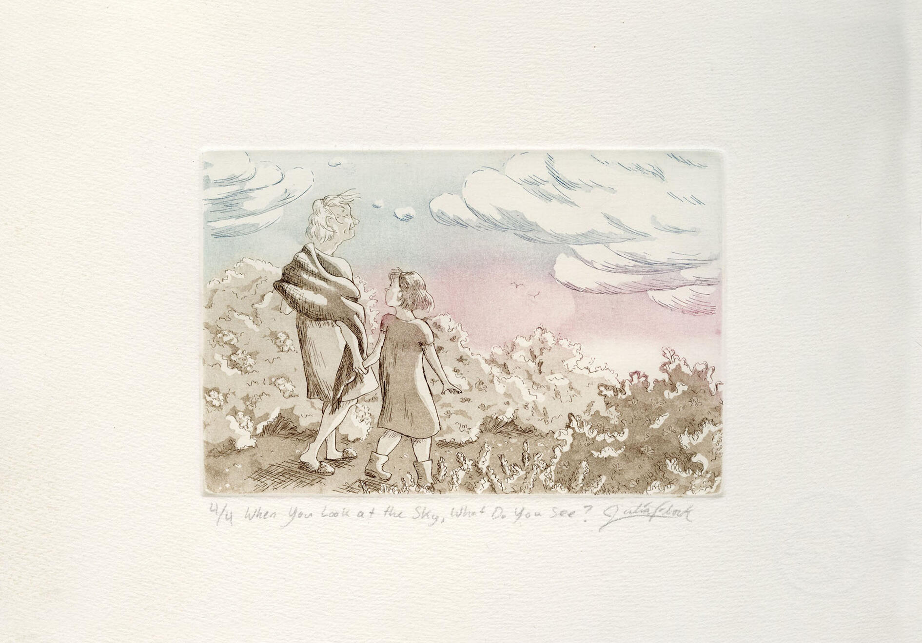
When You Look at the Sky, What Do You See?
etching on copper
4"x6"
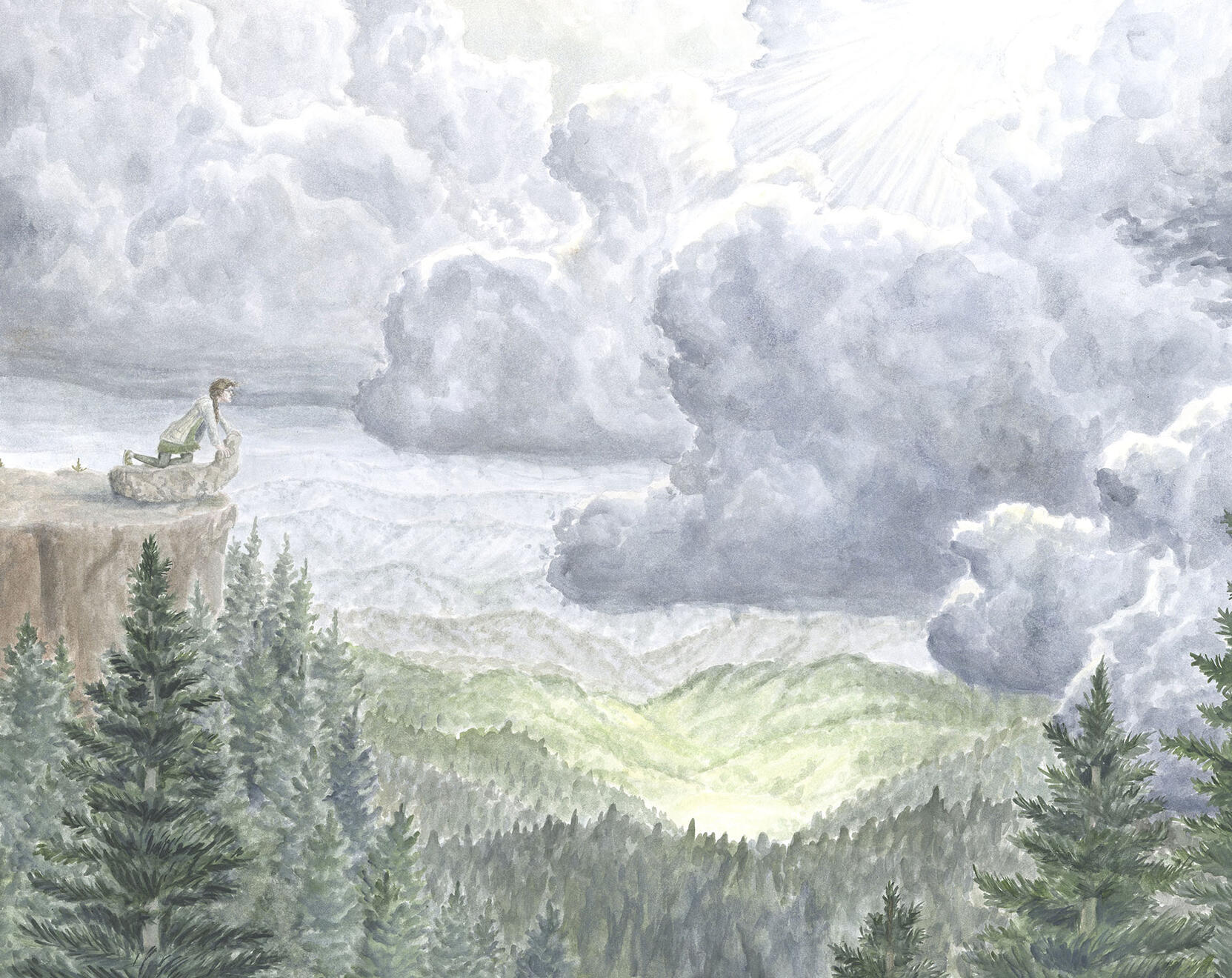
Between the Landmarks
watercolor on illustration board
18"x24"
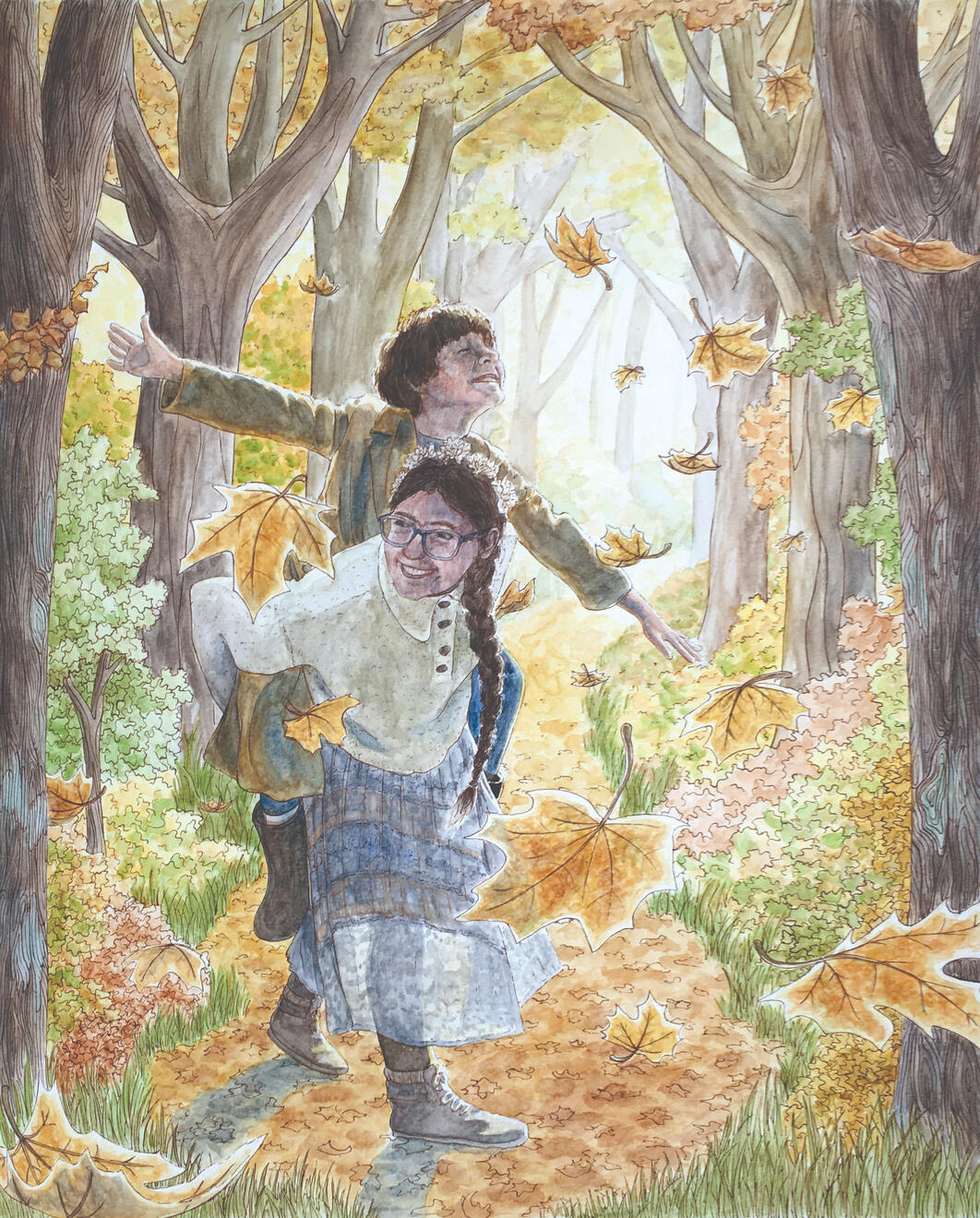
Siblings in Fall
watercolor & ink on paper
20"x16"
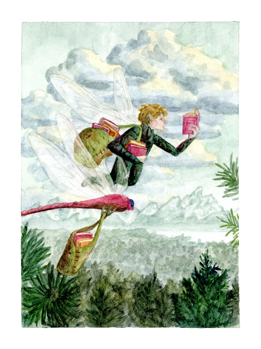
Dragonfly Fairy
watercolor on paper
7"x5"
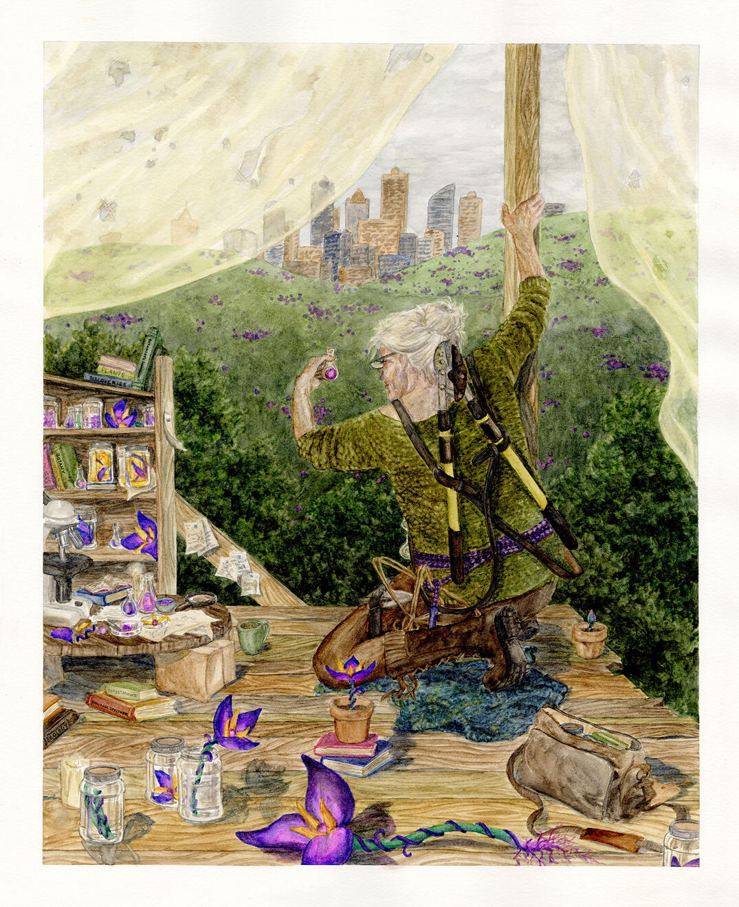
The Botanist in the Apocalypse
watercolor on paper
20"x16"
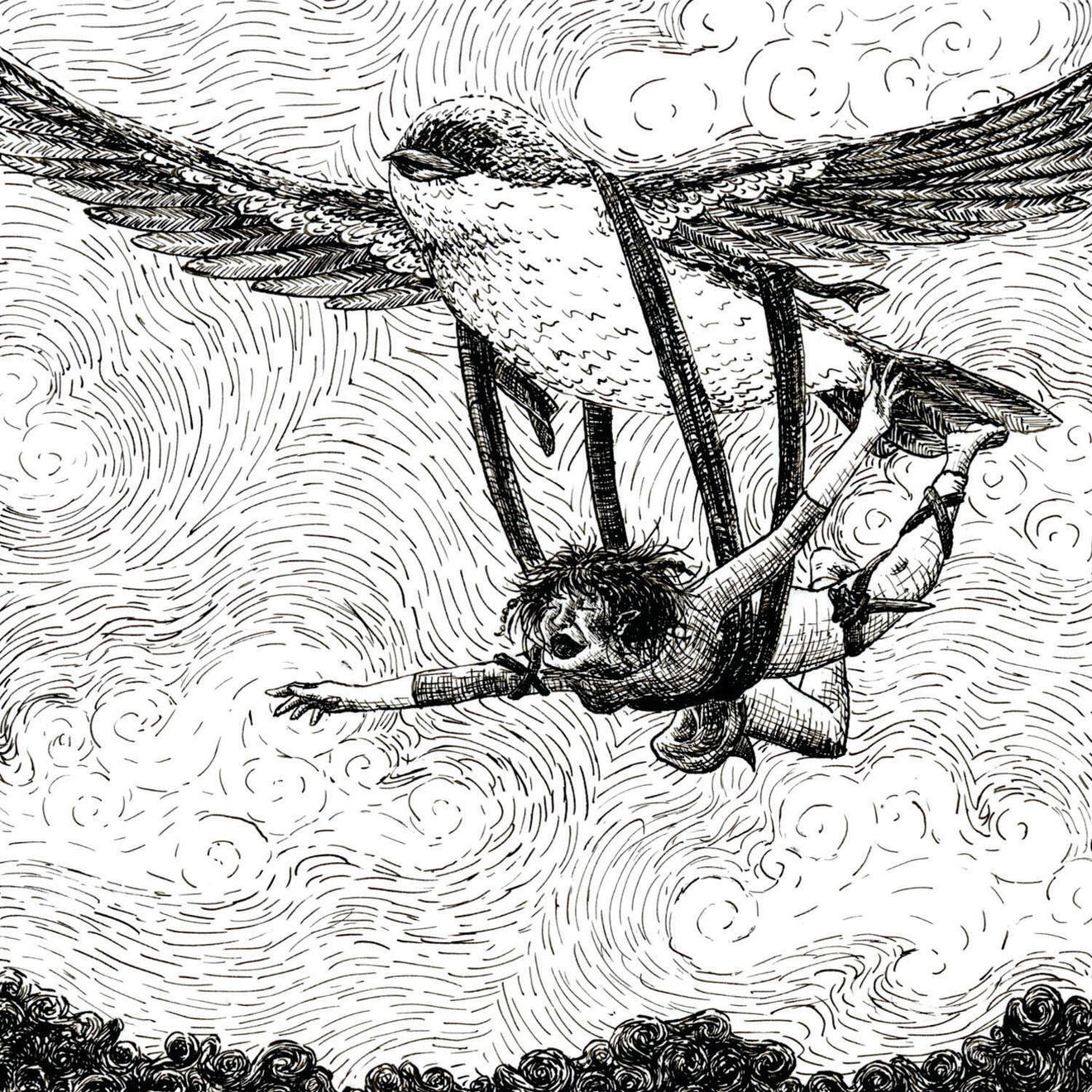
Bird Fairy
ink on illustration board
5"x5"
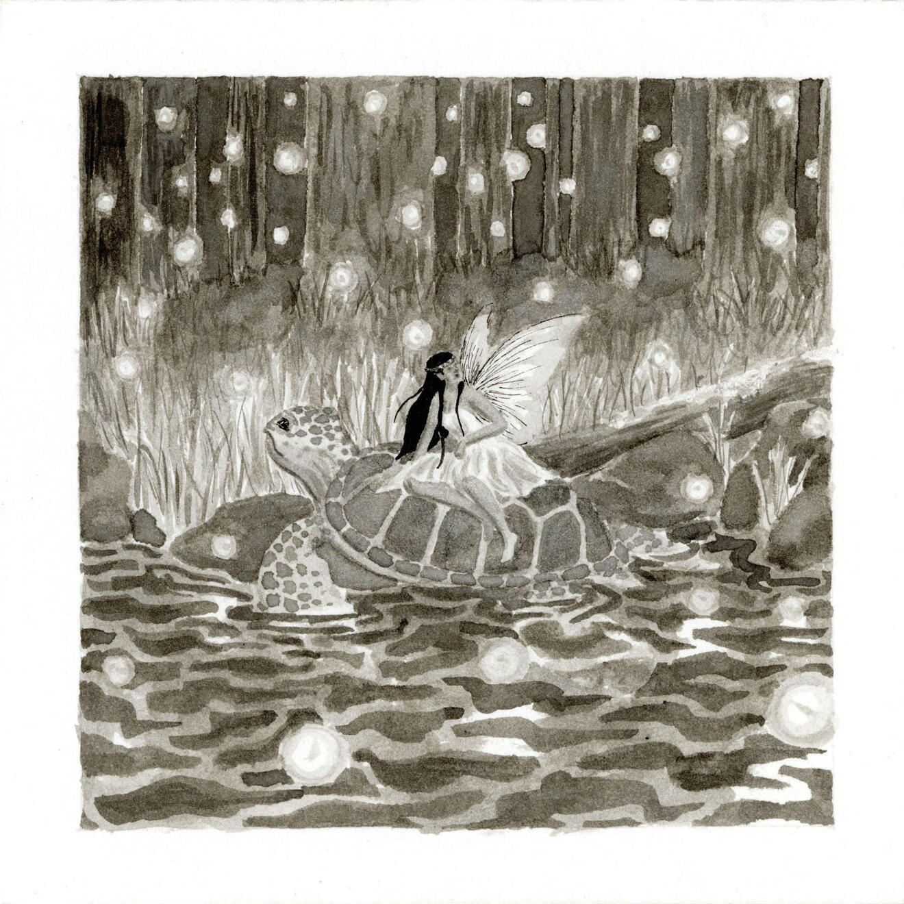
Turtle Fairy
ink on illustration board
5"x5"
Cat Fairy
ink on illustration board
5"x5"
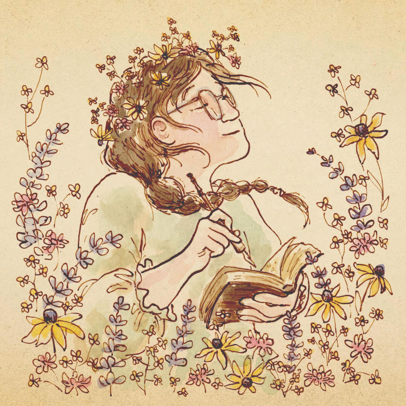
Julia Flock is a storyteller whose voice is deeply rooted in the fairytales of her childhood and a deep love for nature and drawing. Her work seeks to capture joy and wonder on the page, an open invitation into a world of magic and possibilities.
In 2025, she graduated from the Milwaukee Institute of Art & Design, with a BFA in Illustration and minors in Writing, Fine Arts, and Book Arts, summa cum laude—all these work together to support her passion for children’s books. Her illustration work keeps traditional mediums alive, and she has skills in a wide variety of media from oil painting to printmaking. Most of her illustration work is created with watercolor washes over detailed linework, drawn with an old fashioned dip pen and inkwell to capture a sense of vintage naturalism.In those rare moments when she is not drawing or writing, she can be found reading, discussing hobbits with her younger brother, or wandering outdoors, most likely singing and attempting to strum her guitar or studying the wildflowers.
awards
SCBWI Wisconsin Member of the Month | 2025
MIAD Alumni Senior Thesis Award Recipient | 2025
MIAD Board of Trustees Scholarship | 2021-2025
Wisconsin Academic Excellence Scholarship | 2021-2025
1st Place in Prose for R2: The River Rat, vol1. no1. | 2024
Finalist for Trek Bicycle Poster Competition | 2023
3rd Place in Ron Kind Congressional Art Competition | 2021
4th Place in Ron Kind Congressional Art Competition | 2020
featured work & exhibitions
Penfield Poster, Society of Illustrators, Student Scholarship Exhibit | 2025The Willow Kingdom Grew, cover art for R2: The River Rat, Juried Art and Literary Journal, vol. 1, no.3 | 2025The Cardboard Castle of Boxdom Wood, MIAD Senior Exhibit | 2025Hidden Wonders, R2: The River Rat, Juried Art and Literary Journal, vol. 1, no. 2 | 2025In the Shell of a Life Passed, R2: The River Rat, Juried Art and Literary Journal, vol. 1, no. 1 | 2024Multiple works, Don't Call Me Junior! Excerpts from MIAD’s 3rd Year Experience | 2024Thistle Cocktail Recipe, Artful Libations: Artisanal Cocktail Recipes Illustrated by the Students of MIAD | 2024In the Shell of a Life Passed, Ireland: Ballyvaughan—Investigating Place through Text & Image | 2023
If you have a story or a vision needing to be brought to life, I would love to work with you!Reach out to me at [email protected] and we can embark on a journey to bring a little more joy into this world together.
Contact


